
In a split second, the right font can shape perception, drive attention, and influence action. According to Carleton University research, readers form judgments about a webpage’s visual appeal in just 50 milliseconds – and typography plays a major role in that snap decision. Fonts aren’t just decoration, they’re strategic design elements that guide user experience, shape emotional tone, and communicate brand identity before a single word is read.
Typography determines how users navigate content, where their eyes land first, and whether they choose to keep reading or click away. Many businesses ensure this consistency by utilizing a flat rate graphic design service or graphic design subscription to maintain a professional look across all assets. A cluttered or poorly chosen font can instantly reduce trust, while a thoughtful typeface can elevate a brand’s voice and create cohesion across print, web, and mobile platforms.
Let’s break down the key ways fonts shape the outcome of design decisions, starting with the fundamentals of visual hierarchy, personality, and audience perception.
Fonts Create Visual Hierarchy
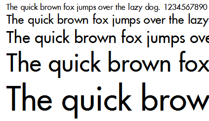
Fonts control flow. Designers use variations in font size, weight, and spacing to guide a reader’s attention from titles to subheadings to body text. For example, bold, uppercase headlines command attention, while lighter body fonts help deliver content without visual noise. Professionals providing on-demand graphic design often utilize fonts with strong contrast—like pairing a heavy display font with a clean sans-serif—to immediately create structure and readability.
Fonts Reflect Brand Personality
Typography choices are just as revealing as color schemes or logos. Serif fonts, for instance, suggest tradition and reliability, ideal for law firms or editorial publications. Sans-serifs feel contemporary and accessible, aligning better with tech companies or lifestyle brands. Marketing firms that leverage white label graphic design often rely on these versatile font categories to seamlessly match their clients’ diverse brand voices. Ultimately, the font a brand uses signals tone—whether it’s formal, playful, sophisticated, or innovative.
Fonts Shape User Experience and Trust
Poor legibility breaks trust. If users struggle to read content, because of cramped spacing, low contrast, or overly stylized characters, they’re more likely to disengage. Studies show that readability directly impacts user retention and comprehension. Well-selected fonts improve clarity, reduce cognitive load, and enhance the overall feel of the interface, especially on mobile, where screen size and resolution limitations heighten the importance of clean, scalable typography.
Key Font Categories Every Designer Should Know
Every design project starts with a decision, often, that decision is about choosing the right font category. Font families aren’t just visual styles; they carry meaning, tone, and purpose. Knowing when and how to use each one sets the foundation for layout, branding, and communication. Below is a practical breakdown of the four major categories every designer works with, along with where each shines.
Serif Fonts
Serif fonts are easily recognized by the small lines or strokes attached to the ends of letters. These details give serif typefaces a sense of tradition, sophistication, and structure. They’re often used to suggest authority or timelessness.
Common use cases include:
- Editorial layouts like newspapers, magazines, or journals
- Branding for luxury goods or high-end services
- Print-heavy formats such as novels or formal reports
Serif fonts work well when a project needs to feel classic or dependable. Their formal tone is especially effective in long-form text, where readability and aesthetic refinement go hand-in-hand.
Sans-Serif Fonts
Sans-serif fonts skip the extra strokes. They present clean, uncluttered letterforms, which makes them feel contemporary, direct, and versatile. Their simplicity translates smoothly across print and screen, making them a top pick for digital design.
Designers lean on sans-serifs for:
- Websites, mobile apps, and digital interfaces
- Tech companies or startups wanting a minimalist brand identity
- Marketing assets that require a modern, easy-to-digest look
Fonts in this category are often favored for UI and branding because they don’t distract from content and adapt well to different sizes and screen resolutions.
Script Fonts
Script fonts mimic cursive handwriting. They carry emotion, movement, and flair—perfect for drawing attention or adding a personal touch. However, their highly stylized forms can quickly hurt legibility if overused or applied in dense blocks of text.
They’re best reserved for:
- Wedding invitations or greeting cards
- Brand logos that want to express elegance or creativity
- Occasional highlights in packaging or posters
Use script fonts sparingly. They make a big impact but can overwhelm a layout or reduce clarity when used outside of decorative purposes.
Display Fonts
Display fonts are built to stand out. Whether bold, experimental, or unconventional, they’re meant for short bursts of text where making an impression matters. These are statement fonts, ideal for grabbing attention, not carrying paragraphs.
Strong use cases include:
- Headlines on posters, websites, or editorial spreads
- Event graphics or banners
- Campaign slogans or hero sections
Display fonts should be used with intention. Because of their intensity and visual weight, it’s important to balance them with neutral text styles elsewhere in the design.
Most Common Serif Fonts Used by Graphic Designers
Serif fonts often bring a sense of structure, trust, and heritage to design work. When used well, they can add depth and distinction to layouts that need to feel polished or authoritative. Below are three serif fonts that continue to hold their place in professional design, each offering a different tone and use case.
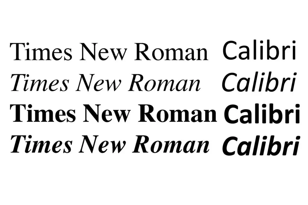
Times New Roman
No serif font is more recognized, or more enduring, than Times New Roman. Originally created in 1931 for The Times newspaper, it was designed to deliver maximum legibility in compact print formats. That precision carried over to digital, where its tight spacing and balanced letterforms made it a default across word processors and academic documents.
Today, it still signals tradition and professionalism. Designers reach for it when a project needs to communicate reliability, particularly in publishing, corporate templates, or legal documents. It’s not flashy, but it holds authority through familiarity.
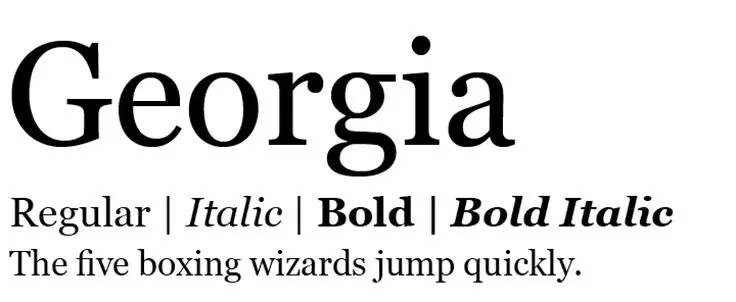
Georgia
Georgia was designed specifically for screen readability, and that’s where it excels. Created in the mid-1990s, its slightly larger letterforms and generous spacing make it far easier to read on monitors than older serif fonts. This clarity gave it a strong foothold in early web design, and it continues to be a solid choice for content-rich sites today.
Its tone is warm but still formal, which makes it versatile enough for blogs, long-form content, or any site that wants a traditional look without sacrificing readability. It also works well as body copy when serif styling is needed without looking too stiff.
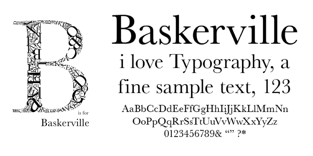
Baskerville
Baskerville sits at the intersection of elegance and restraint. Developed in the 18th century, it’s known for its high contrast between thick and thin strokes, which gives it a refined, upscale feel. It’s a go-to choice for luxury branding, fashion layouts, and print editorials where a sense of refinement matters.
Designers use Baskerville to convey intelligence, sophistication, or artistic taste. It’s not casual, it’s deliberate. Paired with generous whitespace and modern visuals, it helps bridge the gap between classic and contemporary.
Most Common Sans-Serif Fonts Used by Graphic Designers
Sans-serif fonts are the backbone of modern design. Their clean, unembellished lines make them ideal for digital content, where clarity and adaptability are critical. From app interfaces to bold branding, these fonts allow content to shine without distraction. Here are four sans-serif fonts that continue to lead the way in graphic design services, and why they’ve earned their status.
Helvetica
Few fonts are as universally respected, and widely used, as Helvetica. Designed in 1957, it became synonymous with neutrality and balance. Designers turn to it when they need typography that supports the message without overpowering it. Its uniformity and tightly spaced letterforms create visual harmony, especially in branding where consistency matters.
Helvetica is everywhere: corporate logos, transit signage, and user interfaces. It’s a font that feels invisible – in the best way possible – making it a go-to choice for clean, modern visuals that still feel structured.
Futura
Futura brings geometry to the foreground. Created in the 1920s during the Bauhaus era, it’s defined by sharp angles, near-perfect circles, and vertical precision. Its distinctive look makes it ideal for projects that need a forward-thinking or tech-driven tone.
Commonly used in branding, packaging, and technology spaces, Futura communicates a strong, minimal identity. It’s especially effective in layouts that embrace asymmetry or negative space, where its geometric balance adds control and personality.
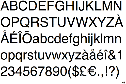
Arial
Arial was designed as a digital-first font, and that practicality made it one of the most widely distributed typefaces in the world. It’s often viewed as the default, not because it’s flashy, but because it’s reliable. With broad language support and screen-friendly proportions, Arial is a safe fallback that maintains readability across systems and formats.
Graphic designers often rely on Arial when creating digital mockups, system templates, or accessible designs where compatibility is a priority. While not particularly expressive, it’s dependable and readable at almost any size.

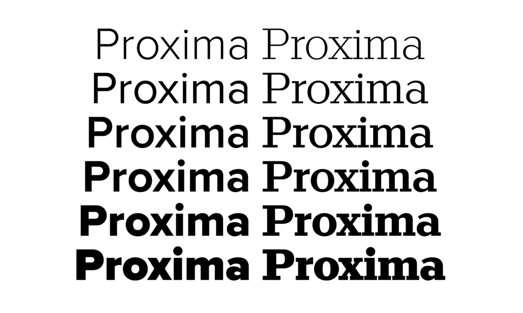
Proxima Nova
Proxima Nova strikes a balance between geometric and humanist styles. Designed in 2005, it quickly became popular for web and UI design. It blends the simplicity of a sans-serif with rounded, approachable letterforms that feel warm and friendly, without losing structure.
It’s a common sight in digital branding, online publications, and user interfaces. Designers appreciate how it scales across mobile and desktop layouts while maintaining a consistent tone. Proxima Nova offers the flexibility needed for modern digital environments without compromising personality.
Most Common Script and Display Fonts
When designers want to break away from minimalism and inject personality into a layout, script and display fonts step in. These typefaces don’t just deliver information, they express mood, style, and emotion. Whether you’re designing a playful logo or a statement headline, these fonts create visual interest that grabs attention. Here are three widely used fonts that bring bold character to creative projects.
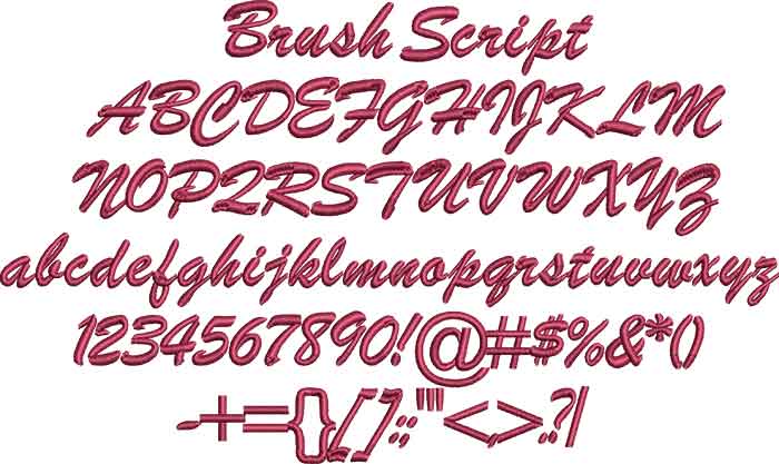
Brush Script
Brush Script channels a handwritten, 1940s-era aesthetic that feels casual and nostalgic. Its flowing letterforms mimic real brushstrokes, giving it an expressive, retro vibe. Designers often reach for Brush Script when they want something informal yet distinctive.
It’s a popular choice for vintage-themed branding, café menus, and event invites that aim to feel personal and friendly. That said, it’s best used in moderation, especially at larger sizes or in short bursts of text, since its legibility drops quickly in longer phrases or smaller formats.
Lobster
Lobster stands out with its bold, looping curves and tight spacing. Originally released as a free web font, it’s now widely seen across packaging, signage, and logo design. It feels approachable and playful, which is why it’s often used by brands looking to convey warmth and creativity.
Unlike more traditional scripts, Lobster includes alternates and ligatures that help it adapt more naturally across different words. That flexibility makes it easy to work into digital and print layouts without sacrificing style.

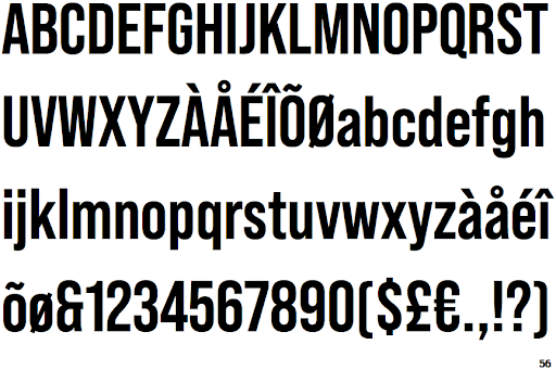
Bebas Neue
Bebas Neue is the opposite of subtle. It’s bold, all-caps, and purpose-built for impact. With its clean lines and strong verticals, it commands attention in posters, headers, and advertisements. There’s no mistaking its tone, confident, modern, and direct.
Designers lean on Bebas Neue when they need typographic volume without visual clutter. It pairs well with lighter fonts for contrast and works best in layouts where hierarchy and focus are key.
How to Choose the Right Font for Your Design Project
Font selection isn’t just an aesthetic decision, it’s strategic. Every project has its own voice, purpose, and audience, and the typography you choose needs to support all three. A great design doesn’t rely on trendiness, it communicates clearly and fits its context. Below are three core principles to guide your font choices and ensure your typography does more than look good, it works.
Match Font to Brand Personality
Fonts speak before words do. A sharp, modern sans-serif suggests innovation and clarity. A refined serif leans into tradition or formality. A bold display font conveys confidence or energy, while a script font may express warmth or creativity. The key is making sure the tone of your typography reflects the tone of your brand.
Start by defining the traits you want the design to convey, professional, playful, luxurious, minimalist, and choose typefaces that align. A high-end fashion label likely won’t use the same fonts as a craft beer startup, and that’s the point. Typography should feel like an extension of the brand’s personality, not an afterthought.
Prioritize Readability and Legibility
No matter how beautiful a font looks, if it’s hard to read, it fails. Always test how your chosen fonts perform in different sizes, especially at small scales. Legibility depends on multiple factors: character spacing, stroke width, contrast, and even how letters interact with each other in longer blocks of text.
Here are practical tips to maintain clarity:
- Use adequate line spacing (leading) to keep lines visually separated.
- Adjust letter spacing (tracking) when fonts feel too tight or too loose.
- Avoid using light or thin weights at small sizes.
- Make sure text contrasts well with the background—especially in mobile layouts.
A font should guide the eye—not force it to work harder.
Combine Fonts Effectively
Good typography often means using more than one font—but only when done with purpose. The best pairings create hierarchy, contrast, and visual rhythm. Start by limiting yourself to two fonts: one for headings, one for body text. That keeps the layout structured without looking chaotic.
Classic pairings include:
- A serif headline with a sans-serif body (e.g., Playfair Display + Open Sans)
- A bold display font for headers with a neutral sans-serif underneath
- Two fonts from the same family with different weights or styles
Make sure they don’t compete. If both fonts have strong personalities, they may clash. Choose one to lead and let the other support it.
Tools and Resources for Exploring and Testing Fonts
Choosing the right font is only the first step, testing it in real-world contexts is where great design decisions are made. Fortunately, a range of tools makes font discovery, comparison, and pairing more efficient and accessible. Whether you’re designing a brand identity, website, or presentation, these platforms offer useful ways to see how fonts behave across styles, weights, and layouts.
Google Fonts
Google Fonts is one of the most accessible type libraries available. It’s free, web-optimized, and packed with over 1,500 open-source fonts ready for commercial use. The platform lets you test fonts with live previews, adjust styles and weights, and compare side by side.
Why designers use it:
- Seamless integration with websites via a simple embed code
- Full access to font files for offline use in design software
- Easy filtering by categories like serif, sans-serif, and display
It’s a go-to resource for designers working across both print and digital, especially when web performance and open licensing are non-negotiable.
Adobe Fonts
Included with any Adobe Creative Cloud subscription, Adobe Fonts offers a robust library that syncs directly with software like Photoshop, Illustrator, and InDesign. Fonts activate with one click and remain available across all desktop applications.
Key advantages:
- Thousands of high-quality fonts from foundries like TypeTogether and FontFont
- No desktop installation required—fonts are cloud-synced
- Easy to test in-app as you design, eliminating extra steps
For designers already working in the Adobe ecosystem, this makes font exploration seamless and deeply integrated into their workflow.
Font Pairing Tools
Pairing fonts isn’t always intuitive – but dedicated tools make it easier to test combinations before committing. Two of the most popular:
Fontjoy:
Fontjoy uses machine learning to suggest font pairings based on contrast, style compatibility, and hierarchy. You can lock one font and cycle through pairings to see real-time previews.
Canva Font Combinations:
Canva’s tool lets you select a starting font and view pre-curated pairings that work well together. It’s especially useful for beginners or for quickly generating ideas that don’t clash.
Both tools save time when testing headlines, subheads, and body text against each other—without needing to open design software.
Final Tips for Using Fonts Like a Pro
Once you’ve chosen your fonts and tested them across styles and pairings, the real work begins, using them consistently and with intention. Even the best font can undermine a project if applied carelessly. Professional designers understand that typography is about restraint just as much as creativity. Below are key principles to keep your type choices sharp and purposeful.
Avoid Overusing Decorative Fonts
Decorative fonts have a strong voice, but they speak too loudly when overused. Their stylized features are designed to grab attention, not to carry the weight of entire layouts. Using them in body copy, navigation menus, or dense text blocks creates visual friction that disrupts the experience.
Save decorative fonts for:
- Short headlines
- Section titles
- Emphasis elements like pull quotes or callouts
Treat them like seasoning, not the main ingredient.
Stick to a Limited Font Palette
Limiting your palette keeps your design cohesive. Too many fonts on a single page distract the viewer and weaken brand recognition. Most professional design systems rely on just two typefaces, often from the same family or with complementary styles.
A good rule of thumb:
- One font for headings
- One font for body text
- Optional third for accents (sparingly used)
Consistency across all content, web, print, social, builds trust and makes your brand feel more considered.
Test Fonts Across Devices and Mediums
A font that looks perfect on a desktop mockup might fall apart on mobile or in print. That’s why cross-platform testing is essential. Always preview your typography on different screen sizes, resolutions, and operating systems to catch issues like poor scaling, contrast loss, or rendering bugs.
Key things to check:
- Mobile readability (especially small text)
- Color contrast under different lighting conditions
- Compatibility with browser defaults and fallback fonts
Also, if you’re designing for print, review the font’s performance in high-resolution outputs to avoid blurry or uneven lines.
Fonts don’t just style content, they shape how users absorb it. When chosen and applied with care, they elevate a design from functional to memorable. For businesses looking to stand out visually, investing time in smart font strategy pays off across every touchpoint.
Explore how BuzzCube can help refine your visual identity with expert graphic design and branding support.