
How to Use Figma to Design a Website

Figma isn’t just another design tool - it’s purpose-built for interface and website design, and it's rapidly becoming the industry standard. Over 80% of top design teams now use Figma for UI/UX projects, according to the 2024 Design Tools Survey by UXTools. That shift is driven by its browser-based setup, real-time collaboration, and component-driven workflow that makes complex web projects easier to manage.
Unlike traditional desktop apps, Figma runs entirely in the cloud. There’s no software to install, and projects update instantly across your team. It's designed specifically for modern interface work - wireframing, high-fidelity mockups, responsive layouts, and interactive prototypes, so you're not just sketching ideas, you're building the foundation for a full website.
Here’s what sets Figma apart for web design:
- Real-time collaboration: Multiple team members can edit and comment simultaneously.
- Vector-based design: Everything is scalable and sharp on any screen size.
- Reusable components: Buttons, nav bars, and other UI elements can be created once and reused across your pages.
- Plugin ecosystem: Automate tasks, generate content, check accessibility, or pull icons and illustrations, without leaving the app.
Figma isn’t built for general illustration or photo editing. Its real strength lies in structured, interactive design, ideal for creating entire websites from wireframe to developer handoff.
Setting Up Figma for Website Projects
Before you dive into layout or typography, the first step is setting up your workspace properly. A clean, well-organized file helps avoid chaos later, and it sets you up for fast iteration and smooth handoff.
Creating a New Figma File and Choosing the Right Frame Sizes
To begin:
- Log into your Figma account and create a New Design File.
- From the toolbar, select the Frame Tool (F) - this is how you define screen sizes.
- Choose preset dimensions like Desktop (1440 x 1024), Tablet (768 x 1024), or Mobile (375 x 812).
- Use grids and layout columns to structure spacing, alignment, and balance.
Grid tip: A 12-column grid is a standard choice for desktop web design. It supports flexible layout behavior and works well with frameworks like Bootstrap or CSS Grid.
Starting with multiple frames for each breakpoint (desktop, tablet, mobile) ensures responsive design is baked in from the start, not bolted on later.
Organizing Pages, Layers, and Naming Conventions
As your project grows, sloppy layers turn into major roadblocks. Avoid that by organizing from day one.
Best practices include:
- Separate pages for different stages: Wireframes, UI Design, Prototype, Assets
- Group related elements (e.g., navbar items, footers, cards) into frames
- Use consistent naming: btn/primary, section/about-hero, img/logo-dark
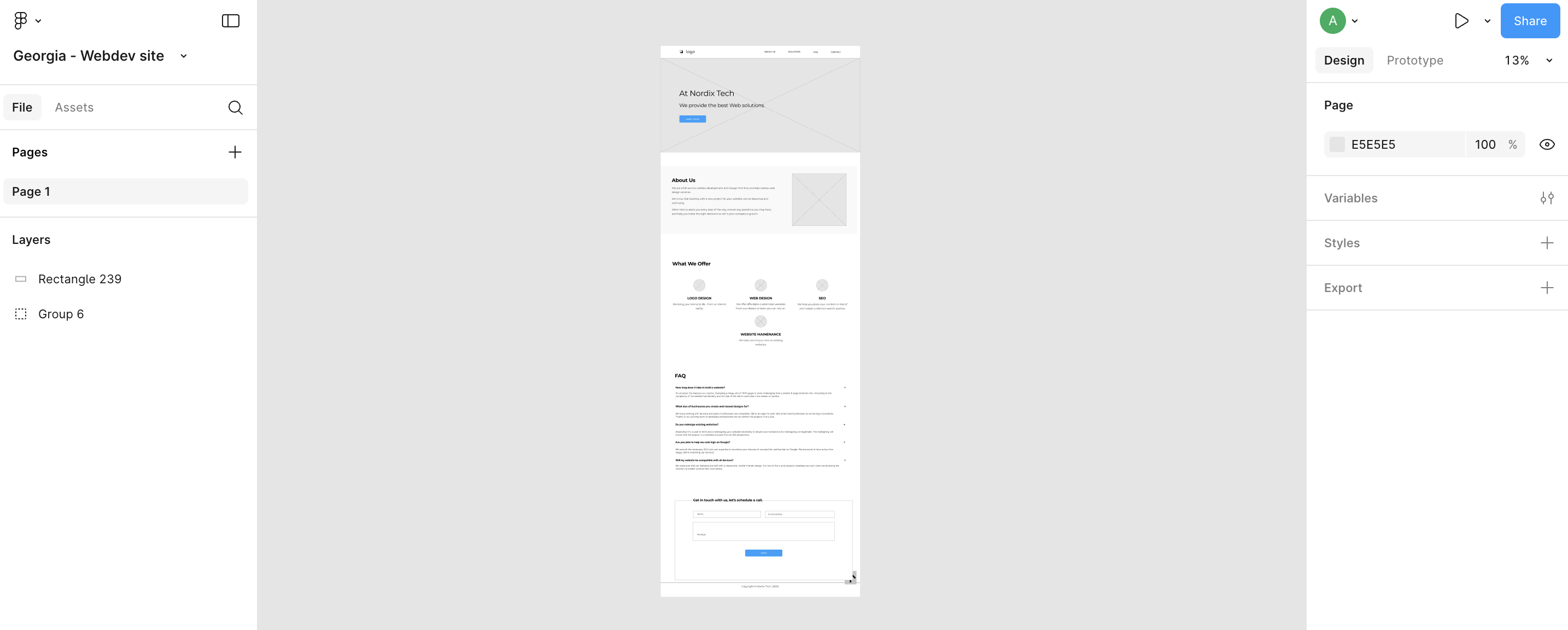
Always rename frames and layers clearly. “Rectangle 17” tells no one anything. “CTA Button – Orange” is instantly clear, even to a developer reviewing the file for the first time.
Importing Brand Assets and Style Guides
Web projects should reflect the brand from the first mockup, not added at the end. Figma makes it easy to centralize brand elements:
- Upload your logo, icons, or imagery using drag and drop into the Assets panel.
- Create Text Styles (e.g., Heading 1, Body, Button Label) and Color Styles (e.g., Primary Blue, Background Light) to ensure consistency.
- Use the Style panel to apply these assets across your file.
If you’re designing for a client, request a style guide upfront—or build one into the first page of your file. This saves hours of rework and keeps your visual language aligned from start to finish.
Wireframing the Website Structure
Before jumping into typography or colors, every strong website design starts with structure. Wireframing helps clarify layout, hierarchy, and navigation before you touch any visuals. It’s about getting the blueprint right. According to Nielsen Norman Group, early-stage wireframing reduces design rework by up to 50%, saving time and confusion later.
Creating Low-Fidelity Wireframes
Low-fidelity wireframes strip design down to its essentials. Forget gradients or fonts—focus on layout, content blocks, and flow.
Here’s how to get started in Figma:
- Use the Frame Tool (F) to create separate canvases for each key page: Homepage, About, Services, Contact.
- Stick to basic shapes (rectangles, lines, placeholders) to map out:
- Hero sections
- Navigation
- Body content
- Call-to-action areas
- Footer blocks
Use grayscale colors and dummy text (like “Heading,” “Paragraph,” “CTA Button”) to avoid visual distractions. The goal is to validate structure, not polish.
Pro Tip: Add a sticky note or comment on each frame explaining the page’s purpose or key user action. It helps keep things user-focused as you iterate.
Defining Navigation and User Flows
A site that looks great but confuses visitors is a failed design. Map your user journeys directly in the wireframe.
Use simple arrows or Figma’s Prototype model to simulate how users move between pages. Define:
- Main navigation (Home, About, Services, Contact)
- Secondary links (e.g., footer, sidebar, CTAs)
- Conversion paths (like button clicks that lead to a contact form)
Keep the layout logical—top-down, left-to-right—and consistent across pages. Navigation should feel predictable, not clever.
Checklist:
- Does every page have a clear next step?
- Are CTAs visible above the fold?
- Can users access the main nav from every screen size?
Once your wireframe makes sense on its own, you’re ready to bring it to life with visual design.
Designing High-Fidelity Website UI in Figma
Wireframes are for structure, high-fidelity design is where personality and polish come in. At this stage, you’ll apply your brand’s typography, color, and imagery, turning skeletons into scroll-worthy pages.
Applying Visual Styles (Typography, Color, Buttons)
Start by defining a style guide within Figma using Text Styles and Color Styles:
- Typography: Set sizes, weights, and line heights for Headings, Body, Links, and Buttons.
- Color Palette: Include background, text, primary/secondary button states, links, and accents.
- Buttons and Forms: Use real labels like “Book a Demo” or “Get Started” to make designs feel live.
Apply those styles consistently across your wireframes—don’t manually adjust fonts or colors unless you’re updating a master style.
Note: Always design with accessibility in mind. Make sure contrast levels meet WCAG guidelines, especially for text on colored backgrounds.
Using Components and Auto Layout for Efficiency
Figma’s Components and AutoLayout turn you from a designer into a system builder.
- Components: Create once, reuse forever. Design a button, card, or navbar as a component, then reuse it across your pages. When you update the master, all instances follow.
- Auto Layout: Adds rules to your elements—padding, spacing, resizing—so they adapt automatically to content changes or screen sizes.
Use Components for:
- Buttons
- Headers and footers
- Cards (services, testimonials, blogs)
- Pricing blocks
Auto Layout works especially well inside containers like forms, navbars, and section rows—anything that needs dynamic spacing.
Designing for Responsive Breakpoints
Don’t wait until the end to think mobile-first. Set up your design to work across all major breakpoints: desktop, tablet, and mobile.
In Figma:
- Duplicate your desktop frame and resize it to mobile dimensions (e.g., 375px wide).
- Adjust layout using Constraints (found in the right-hand sidebar) to control how elements behave when the frame size changes.
- Stack vertically on mobile and scale down font sizes, padding, and image widths.
Use a grid and base spacing system to stay consistent across breakpoints. Consistency across screen sizes builds trust and usability.
Creating Interactive Prototypes in Figma
Static designs only tell half the story. With prototypes, your ideas come to life—showing how users move, click, scroll, and interact with your site. And Figma makes it easy. According to the UX Design Institute, prototyping early improves user testing outcomes by 30–50%, giving you faster, more actionable feedback.
Linking Pages and Setting Interactions
To simulate navigation between pages:
- Switch to Prototype mode (top-right corner).
- Select an element—like a button or nav link.
- Drag the blue arrow to the destination frame.
- Set interaction details in the sidebar:
- On click
- Navigate to [Frame Name]
- Animation style: Instant, Dissolve, Smart Animate
For multi-page flows, label each frame clearly—Home, Services, Contact—so it’s easy to map where interactions lead. You can also create a fixed header (with constraints) so your nav stays visible during scroll interactions.
Tip: Test your flow as you build it. Click “Present” to preview your site just like a user would.
Adding Hover States, Animations, and Microinteractions
Subtle motion matters. It guides attention, improves usability, and makes your UI feel responsive.
To add a hover interaction:
- Create a duplicate component variant (e.g., normal button and hover button).
- Go to Prototype, select the default variant, and drag an interaction to the hover variant.
- Set Trigger to “While hovering” and Animation to “Smart Animate.”
Use the same approach for microinteractions like:
- Button presses
- Tab switches
- Accordion toggles
- Form input feedback
Keep animations subtle, think 150–300 ms transitions. Anything longer feels laggy.
Collaborating and Sharing Designs with Teams and Clients
Good design isn’t created in isolation. Figma’s collaborative features let teams work in real time and streamline review processes without endless email threads or exported PDFs.
Inviting Team Members and Managing Permissions
To share your design:
- Click Share (top-right).
- Add team member emails or copy the link.
- Set permissions:
- Can view (for stakeholders)
- Can edit (for collaborators)
Use Teams and Projects inside Figma if you’re managing a larger organization or working across multiple files.
To protect sensitive work, disable link access or limit viewing to logged-in collaborators.
Using Figma Comments for Design Feedback
Forget screenshot feedback or vague email notes. Figma lets reviewers leave comments directly on elements.
- Click the Comment icon in the toolbar.
- Click anywhere on the canvas to leave a note.
- Mention teammates using @name to notify them instantly.
You can reply, resolve, or reopen threads, making it easy to track decisions and design changes over time.
Bonus tip: Keep comments organized by topic (e.g., “Typography,” “Spacing,” “CTA language”) to make reviews efficient.
Preparing Figma Designs for Development Handoff
Designs aren’t done until developers can build from them—without guessing or chasing down assets. A smooth handoff saves time and prevents errors that slow down production. Figma simplifies this process with built-in tools that provide dev-ready specs and export options in just a few clicks.
Setting Up Design Specs and Inspect Mode
Figma’s Inspect panel gives developers the information they need—directly from the design file.
To activate Inspect mode:
- Click on any frame or element.
- Switch to the Inspect tab on the right sidebar.
- Developers will see specs like:
- Padding and spacing
- Font sizes and colors
- Border radius and shadows
- Export-ready assets
All values are available in px, rem, or %, depending on what’s needed. Developers can also copy CSS, iOS, or Android snippets directly—no manual translation required.
Tip: Before handoff, double-check that:
- All elements are aligned properly.
- Colors and typography are defined using shared styles.
- Components are consistent and reused wherever possible.
Exporting Assets and Sharing Design Links
To export assets:
- Select the element or component.
- In the right sidebar, click + under the “Export” section.
- Choose file type (SVG, PNG, JPG, PDF) and resolution (1x, 2x, etc.).
- Click Export [Asset Name].
Use vector formats (SVG) for icons and logos, and raster formats (PNG, JPG) for images or illustrations. Group similar exports in one folder to keep things tidy.
For dev handoff:
- Share the design file link (with “View” access) so devs can inspect and export directly.
- Lock finalized frames or pages to avoid accidental edits during development.
Using Plugins and Templates to Speed Up Workflow
Figma’s plugin ecosystem is a serious time-saver. Here are a few worth adding:
- Unsplash – Insert high-quality placeholder images fast.
- Iconify – Access thousands of free icons from one place.
- Stark – Check accessibility (contrast, alt text) right in your file.
- Autoflow – Map out UX flows with clean connecting lines.
- Design Lint – Detects inconsistencies in typography, spacing, or color use.
- Content Reel – Drop in realistic text, names, and data for better UI previews.
Templates are also useful when starting from scratch. Look for reputable UI kits (like Figma Community templates) for dashboards, landing pages, or mobile apps.
Maintaining a Consistent Design System
A design system keeps your work scalable and predictable across projects. Even a simple one makes a big difference.
Start with:
- Shared Text Styles for headings, body text, buttons.
- Color Styles with names like Primary, Background, Accent—not hex codes.
- Reusable Components for nav bars, buttons, cards, inputs.
Use Figma’s Team Libraries to store and sync your system across multiple files. This way, updates made in one place reflect everywhere the component is used.
Tip: Document component rules and usage patterns (e.g., spacing between elements, do/don’t guidelines) so others can follow the system intuitively.
Stay connected with news and updates!
Join our mailing list to receive the latest news and updates from our team. You'r information will not be shared.
Stay connected with news and updates!
Join our mailing list to receive the latest news and updates from our team.
Don't worry, your information will not be shared.
