
A 10 minute presentation sounds easy. In reality, it is one of the hardest formats to get right. You have limited time, limited attention, and very little room for error. Many presentations fail because they try to fit too much into too little time.
This guide explains how to create 10 minute presentation slides that are clear, focused, and effective. It is built for business presentations, short talks, and fast decision making environments.
How Long Is a 10 Minute Presentation Really?
A 10 minute presentation rarely gives you a full 10 minutes of speaking time. You lose time to introductions, slide transitions, pauses, and questions. In most cases, you have closer to 8 or 9 minutes of actual delivery time.
People also process information more slowly than speakers expect. When slides change too quickly or contain too much content, audiences fall behind. This is why short presentations need stronger structure and simpler slides than longer ones.
Understanding this time reality is the first step to building effective short presentations.
How Many Slides for a 10 Minute Presentation?
There is no single correct number, but there is a practical range.
For most 10-minute presentations:
- 8 to 12 slides works best
- 1 slide per minute is a safe starting point
- Visual-only slides can move faster than text-heavy slides
Business presentations often benefit from fewer slides with clearer messages. If each slide carries one main idea, the audience can keep up without feeling rushed.
The 4-Phase Quick Presentation Framework
This quick presentation framework helps you use time wisely and keep your message clear.
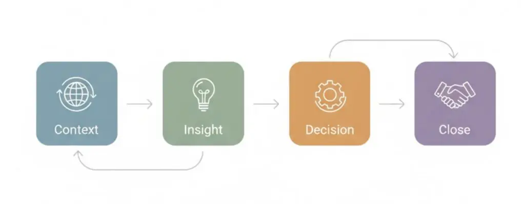
Phase 1: Context (Minute 0 to 1)
Start by setting expectations. Explain what the presentation is about and why it matters to the audience. This helps people focus early.
Recommended slides:
- Title or topic slide
- One slide with the main question or goal
Phase 2: Insight (Minutes 1 to 6)
This is the core of your presentation. Share your key ideas, data, or insights. Limit yourself to three main points at most.
Recommended slides:
- One slide per key idea
- Visuals or charts that support your message
Phase 3: Decision (Minutes 6 to 9)
Explain what your insights mean. Connect them to a decision, recommendation, or takeaway. This section is especially important for presentation design for business settings.
Recommended slides:
- One slide summarizing implications
- One slide with your recommendation or proposal
Phase 4: Close (Minute 9 to 10)
End with clarity. Restate your main message and explain what should happen next.
Recommended slides:
- One clear closing slide with the final takeaway or next step
Slide by Slide Timing Guide for a 10 Minute Presentation
Timing each slide helps you stay on track.
- Title slide: 15 to 30 seconds
- Context slides: 30 to 60 seconds each
- Core content slides: 45 to 75 seconds each
- Closing slide: 30 to 45 seconds
If you practice with these time limits, you reduce the risk of rushing at the end.
How to Create Impactful Slides for Short Presentations
Short presentations require slides that communicate quickly.

One Message Per Slide
Each slide should answer one question or make one point. When slides include multiple ideas, audiences spend time reading instead of listening.
This approach improves effective short presentations and reduces confusion.
Use Visuals to Save Time
Charts, icons, and diagrams often explain ideas faster than text. A simple visual paired with spoken explanation works well in a 10 minute format.
Avoid complex charts that require long explanations.
Keep Text Short and Readable
Limit text to key phrases. Large font sizes help people read slides from a distance and process information quickly.
A good rule:
- Headlines should be readable in three seconds
- Body text should support what you say out loud
Slide Design Best Practices for Business Presentations
Good design supports understanding and credibility.
Use Large Font Sizes
Small text slows people down. For short presentations:
- Headlines should be at least 32 points
- Body text should be at least 24 points
This improves clarity and keeps attention on your message.
Maintain Strong Contrast
High contrast between text and background makes slides easier to read. Light text on dark backgrounds or dark text on light backgrounds both work when contrast is strong.
Avoid subtle color combinations that reduce readability.
Keep Layouts Consistent
Consistent layouts help audiences focus on content instead of design changes. Use the same structure across slides whenever possible.
Short Presentation Tips That Improve Results Instantly
These short presentation tips improve delivery without adding complexity.
Practice With a Timer
Practice the full presentation with a timer. Focus on pacing instead of memorizing exact words. This helps you stay calm and confident.
Design Slides to Support Speech
Slides should guide the audience while you explain the details. Avoid writing full sentences that you plan to read aloud.
Cut Content Early
If your presentation feels rushed during practice, remove slides or reduce content. Cutting early prevents last minute changes that weaken clarity.
Common Mistakes That Hurt 10 Minute Presentation Slides
Short presentations fail for predictable reasons. These mistakes are common in business settings and easy to overlook.
Using Too Many Slides
When presenters include too many slides, they rush through content. This causes anxiety for the speaker and confusion for the audience. Viewers stop processing information once slides move faster than their ability to follow.
If you feel pressure to include more slides, it usually means the message needs refinement. Reducing slide count forces clearer thinking and stronger prioritization.
Overloading Slides With Text
Dense slides slow down understanding. Audiences try to read while also listening, which splits attention. In short presentations, this problem becomes more severe.
Slides should highlight key points only. Supporting details belong in your spoken explanation or follow-up materials.
Showing Data Without Explaining It
Charts and metrics are often added without enough context. Audiences then spend time trying to understand what they are seeing instead of listening to your point.
Every chart should answer one clear question. You should explain why the data matters and what conclusion to draw from it.
Ending Without a Clear Takeaway
Many short presentations end abruptly due to poor time management. This leaves the audience unsure of the message or next step.
A strong ending reinforces your main point and explains what should happen after the presentation. This is especially important in presentation design for business contexts.
Real World Examples of Effective Short Presentations
Understanding how the framework works in real situations makes it easier to apply.
Sales Presentations
In a 10 minute sales presentation, the goal is clarity and interest, not full product education. Focus on:
- The problem the buyer faces
- How your solution addresses it
- The value or outcome
Slides should be visual and high level. Detailed features and pricing can follow in later conversations.
Internal Business Updates
Internal presentations often try to cover too much. A short update works best when it focuses on:
- Current status
- One or two key metrics
- Risks or next actions
This keeps leadership aligned without overwhelming them with detail.
Conference Talks and Lightning Presentations
These formats reward focus. Choose one central idea and build the presentation around it. Use visuals that support storytelling and avoid explaining background information unless it directly supports your message.
This approach improves audience engagement and retention.
How to Adjust 10 Minute Presentation Slides for Different Audiences
Audience needs change how slides should be designed.
Executives and Decision Makers
Executives prefer clarity and relevance. Slides should emphasize outcomes, risks, and recommendations. Avoid technical detail unless it affects decisions.
Clients and External Stakeholders
External audiences need context. Spend more time explaining the problem and less time on internal process details. Use visuals that build trust and credibility.
Internal Teams
Internal teams often want clarity on priorities and expectations. Slides should reinforce alignment and next steps.
Adjusting slide content based on audience improves effective short presentations.
How to Review and Improve Your Slides Before Presenting
A structured review process improves quality.
Step 1: Read Slides Without Speaking
If slides do not make sense on their own, they may lack clarity. Each slide title should explain the main point.
Step 2: Time the Presentation Out Loud
Practice with a timer and speak naturally. Identify slides that take too long to explain and simplify them.
Step 3: Remove or Combine Weak Slides
If a slide does not clearly support your goal, remove it or combine it with another. Fewer strong slides outperform many average ones.
Final Thoughts on Creating Strong 10 Minute Presentation Slides
Short presentations demand discipline. Limited time forces clearer thinking, stronger prioritization, and better slide design. When slides are simple, focused, and aligned with a clear goal, audiences understand and remember more.
By using a structured framework, following slide design best practices, and avoiding common mistakes, you can consistently create effective short presentations that work in real business settings.