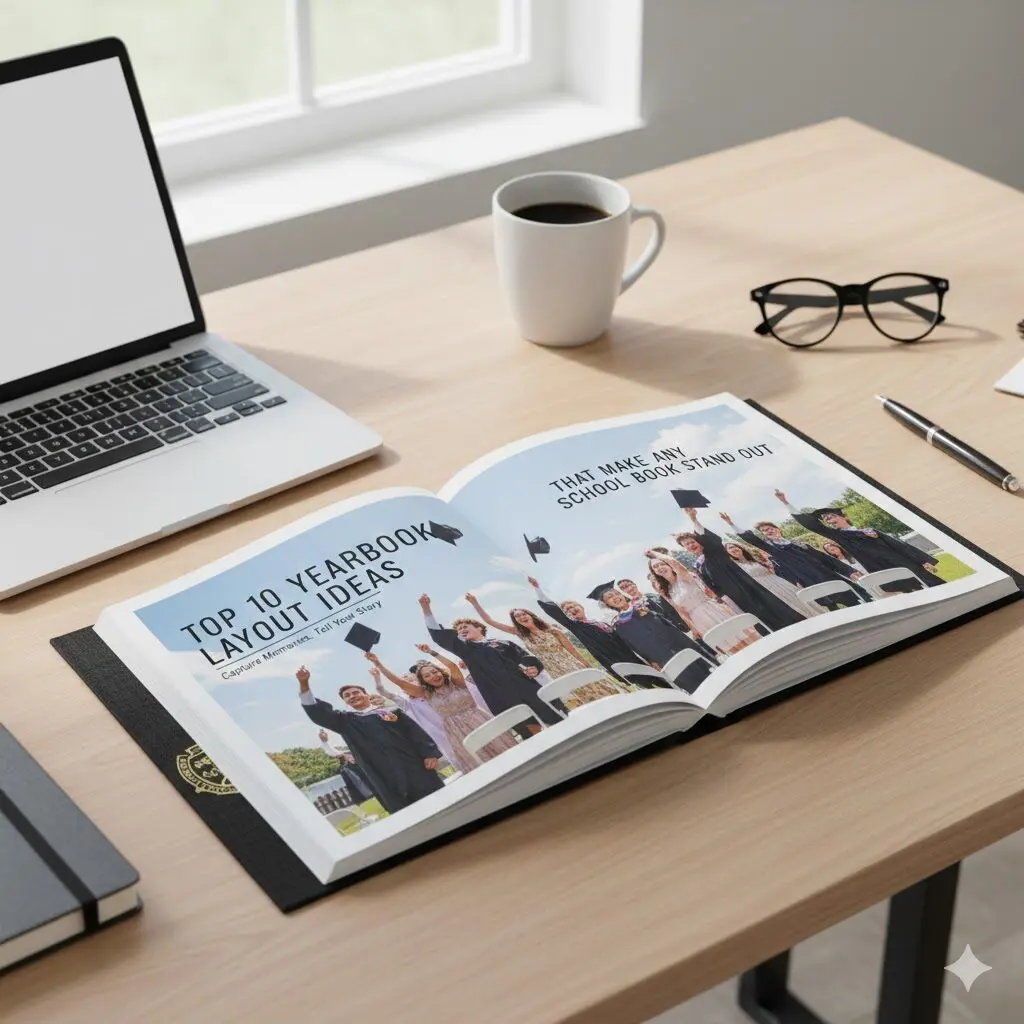
Yearbooks are more than collections of photos. They are records of shared experiences, milestones, and everyday moments that students remember long after graduation. The layout of a yearbook shapes how those memories are seen and understood. A strong layout guides the reader through each page, highlights what matters most, and keeps the book visually engaging from beginning to end.
This article explores ten proven yearbook layout ideas that work for real schools, real students, and real production limits.
What Makes a Good Yearbook Layout
Clear Visual Hierarchy
A good yearbook layout should be easy to understand at first glance. Each page needs one clear focal point, such as a main photo or headline. Supporting photos and captions should be smaller and placed in a way that naturally guides the eye. When too many elements compete for attention, the page feels crowded and confusing.
Consistent Structure
Consistency helps the yearbook feel organized and professional. Repeating layout patterns, font styles, and spacing across sections makes the book easier to read. While photos and content can change, the underlying structure should stay familiar so the design feels intentional.
Balanced White Space
White space gives photos and text room to breathe. Pages with enough space feel cleaner and more readable. Crowded layouts reduce impact and make content harder to enjoy. White space is an active design tool, not wasted space.
Strong Photo Selection
Even the best layout cannot fix weak photos. Choose clear, well-lit images that show real moments and expressions. Fewer high-quality photos usually work better than many low-quality ones. Strong photos allow the layout to stay simple and effective.
Easy-to-Read Typography
Text should be readable for all ages. Simple fonts, clear size differences between headlines and body text, and enough spacing between lines improve readability. Overly decorative fonts make pages harder to read and quickly feel outdated.
Designed for Print
Yearbook layouts must work in print, not just on screen. Proper margins, bleed areas, and image resolution are essential. Ignoring print requirements can lead to cut-off text, poor image quality, or uneven spacing in the final book.
Top 10 Yearbook Layout Ideas
Below are ten carefully selected yearbook layout ideas that schools can realistically use to create a polished and memorable book. These layouts focus on clarity, storytelling, and visual balance rather than decoration alone. Each idea is designed to support different types of content, from class pages to events and student features, while keeping the overall look consistent.
Whether you are looking for creative yearbook layouts, modern yearbook design inspiration, or practical student yearbook layouts that work with common yearbook page templates, these examples can be adapted to fit any school size or grade level.
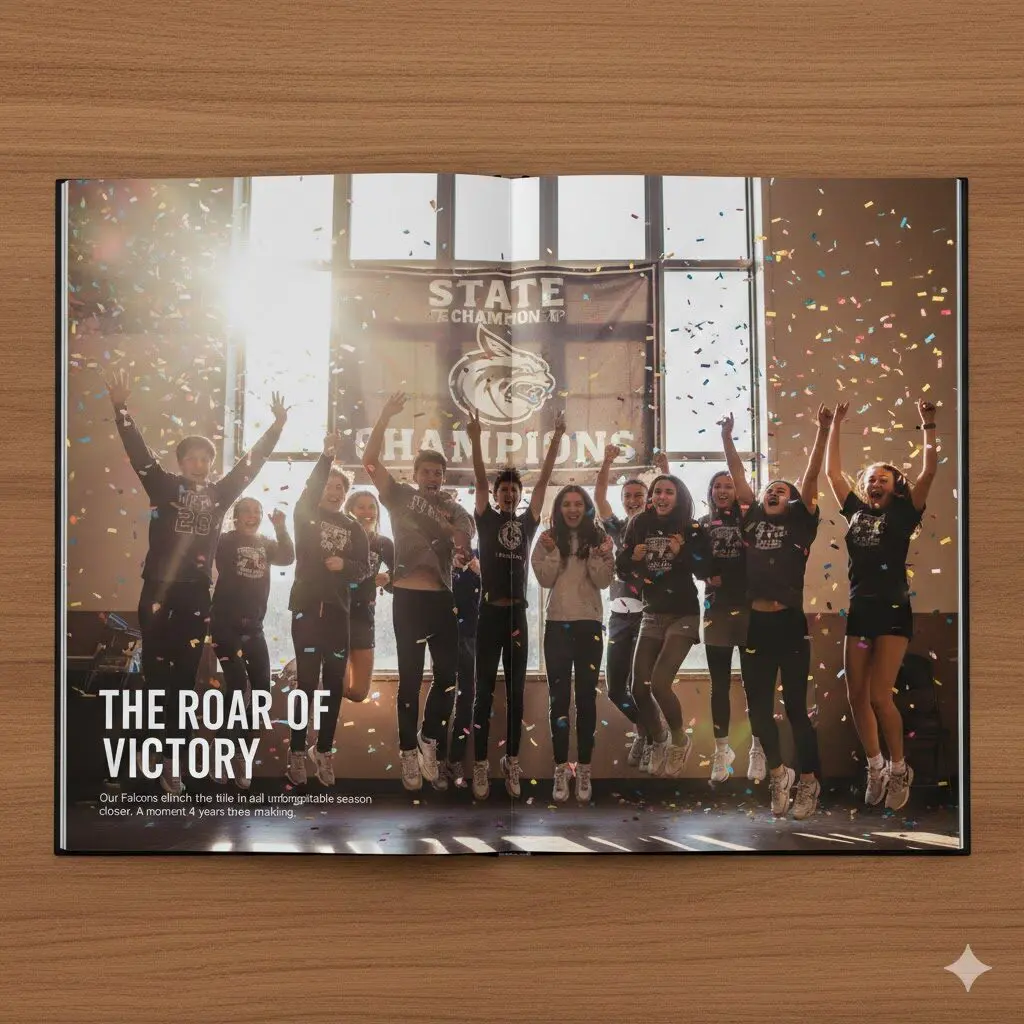
1. Full-Spread Photo Story Layout
The full-spread photo story layout uses one large image across two pages to tell a single powerful story. Text is kept minimal and placed carefully so it supports the image instead of competing with it. This layout works because it allows one moment to fully shine without distraction. It creates emotional impact and gives important events the attention they deserve.
Best for:
- High school events
- Sports and performances
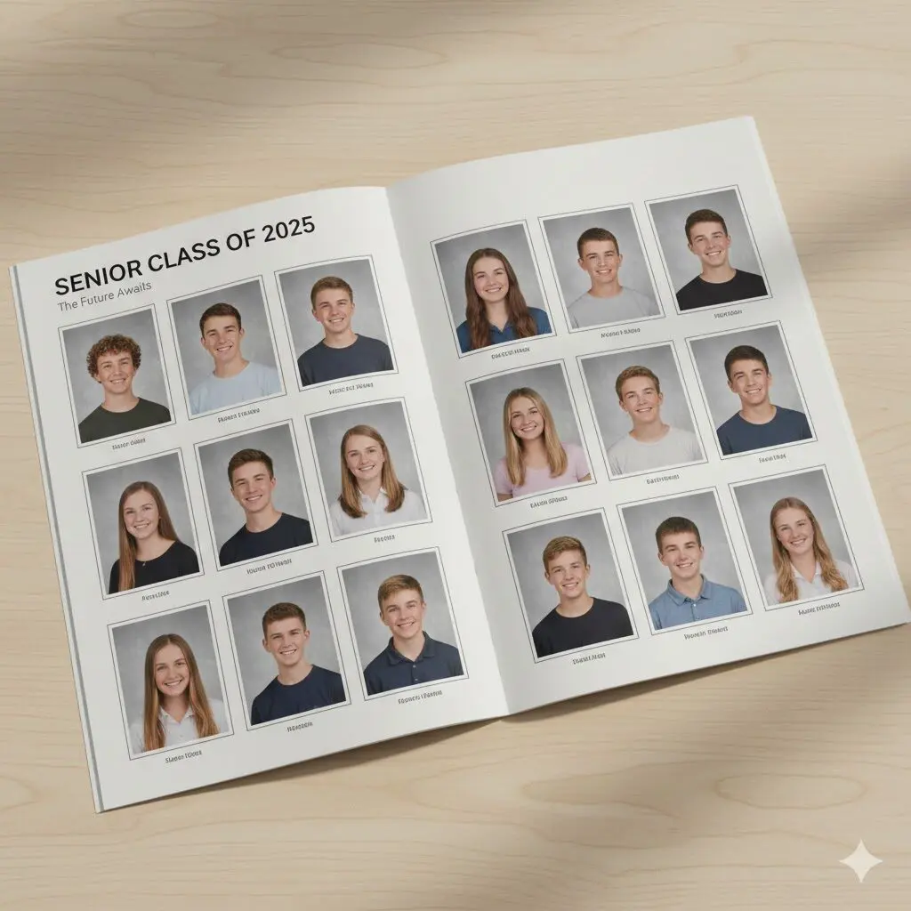
2. Clean Grid Layout for Class Pages
The clean grid layout is one of the most practical yearbook design ideas. It arranges photos in evenly sized boxes, creating order and balance. This layout is easy to repeat across many pages and helps class sections stay consistent. It also makes it easier for readers to find specific students.
Best for:
- Class portraits
- Large schools
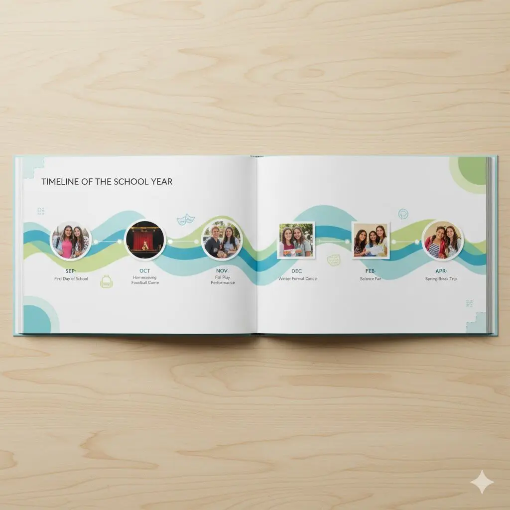
3. Timeline Layout of the School Year
A timeline layout shows the school year in chronological order, using photos, dates, and short captions. This layout helps readers relive the year as it unfolded. It creates a clear narrative and works well for both younger and older students.
Best for:
- Year-in-review sections
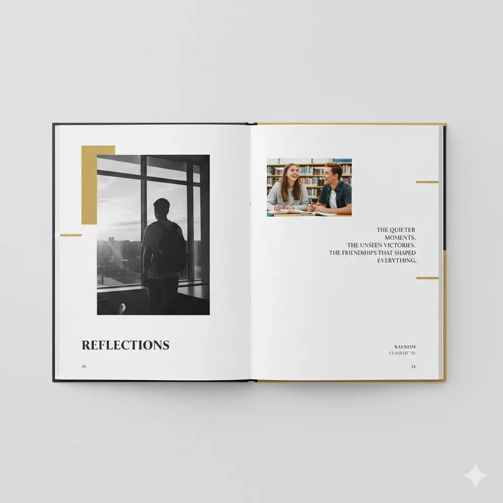
4. Quote-Focused Layout
Quote-focused layouts place student voices at the center of the page. Quotes are given visual priority, with photos used to add context and personality. This layout works because it feels personal and authentic. Readers connect with words just as much as images.
Best for:
- Reflections
- Senior sections
5. Modern Minimalist Layout
Modern minimalist layouts use fewer elements but place them with intention. Strong typography, limited colors, and generous white space define this style. The result feels clean, calm, and contemporary.
Best for:
- High schools
- Editorial-style yearbooks
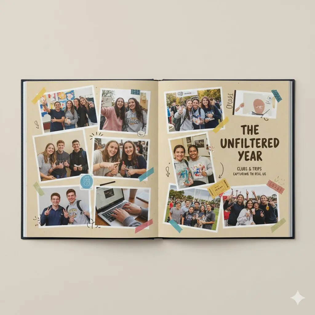
6. Collage-Style Memory Layout
Collage-style layouts arrange photos in a more organic and playful way. Images may overlap slightly or vary in size, creating a scrapbook feel. This layout captures the energy of candid moments and informal events.
Best for:
- Clubs
- Trips
Informal events
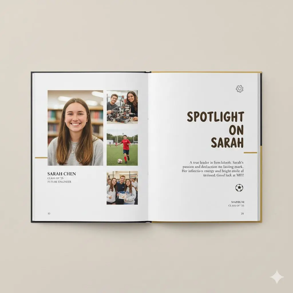
7. Student or Club Spotlight Layout
Spotlight layouts focus on one student, team, or group per page. A main photo is supported by smaller images and short text. This layout works because it gives recognition and makes individuals feel seen.
Best for:
- Clubs
- Teams
Student features
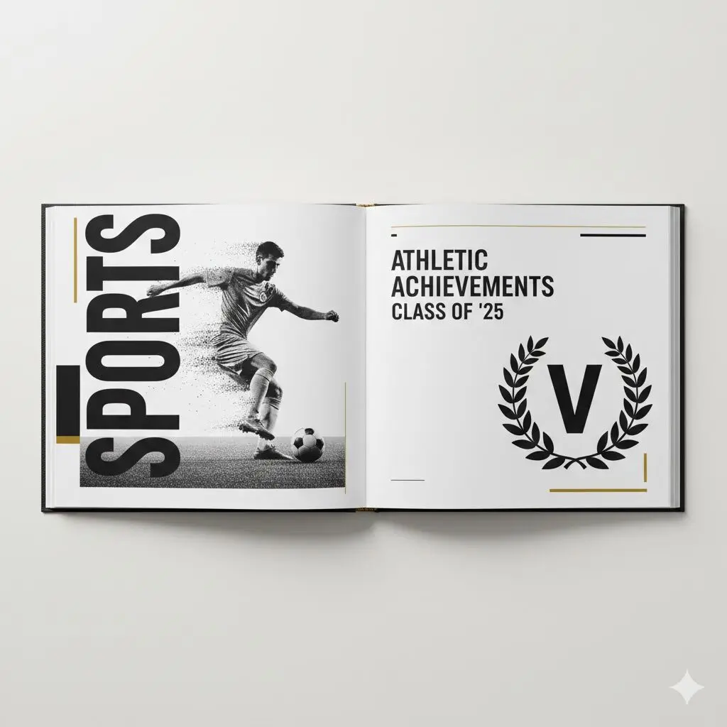
8. Section Divider Layout
Section divider layouts act as visual breaks between major parts of the yearbook. They often feel like mini cover pages, using bold typography and strong imagery. These layouts help readers understand the structure of the book and make navigation easier.
Best for:
- Dividing major sections
9. Fun Facts and Stats Layout
This layout presents school data such as polls, numbers, or highlights in a visual way. Icons, charts, and short text blocks keep information easy to read. This type of layout adds variety and keeps readers engaged.
Best for:
- Student polls
- Year highlights
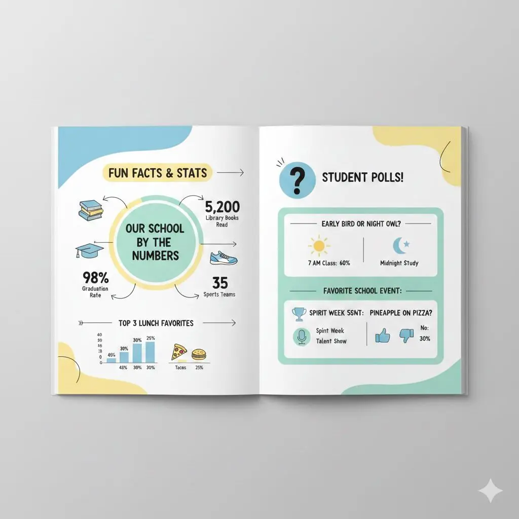
Alt: Fun Facts and Stats Yearbook Layout
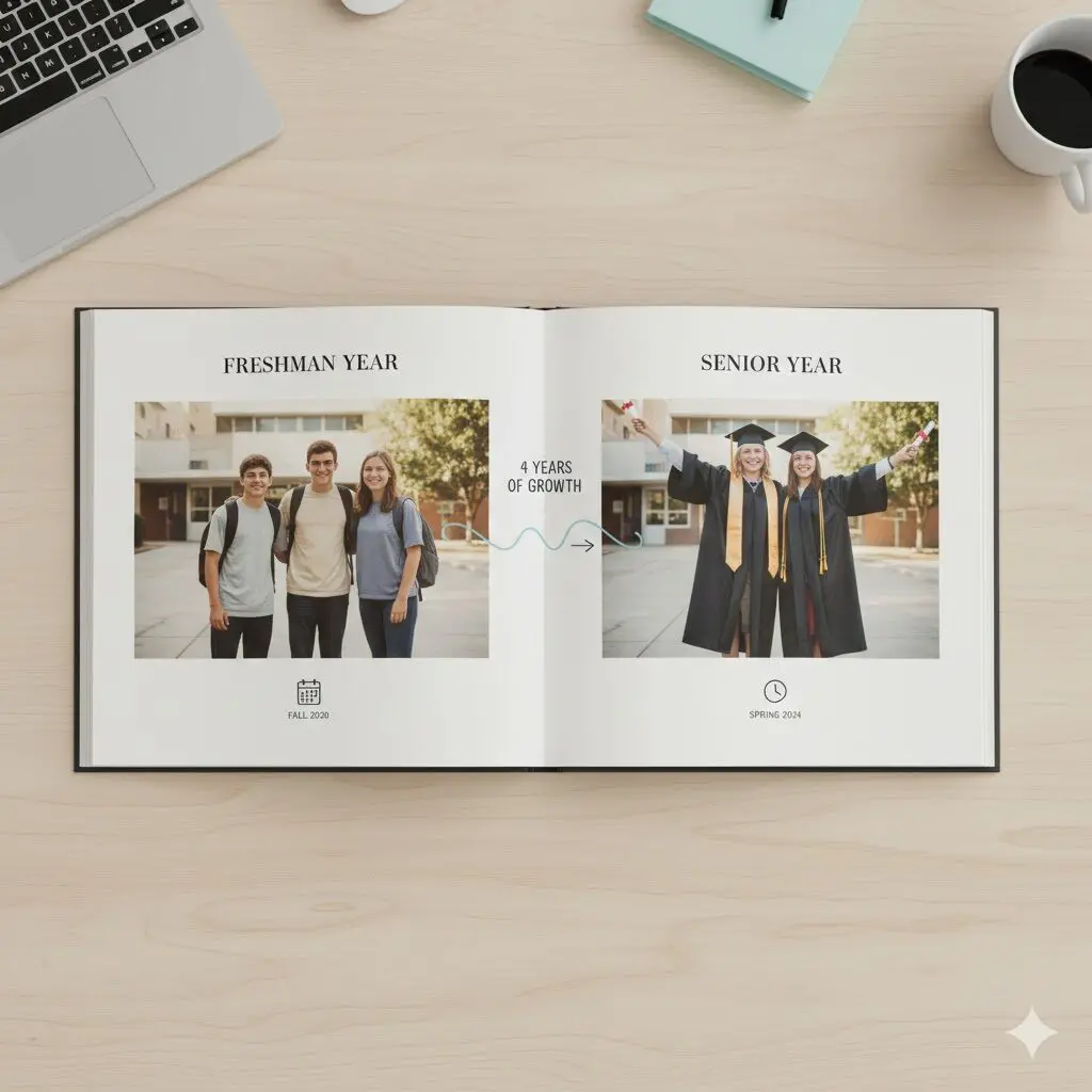
10. Then and Now Comparison Layout
The then and now layout places past and present photos side by side. It shows growth and change in a clear and emotional way. This layout is simple to understand and powerful in impact.
Best for:
- Graduating students
- School milestones
Final Thoughts
Strong yearbooks are built with intention. Using a small set of well-designed layouts consistently creates a book that feels organized, meaningful, and enjoyable to read. The best yearbook layout ideas are not about complexity but about clarity, balance, and storytelling. When layouts support the content instead of competing with it, memories last longer and pages feel timeless.
Need help designing a yearbook? Buzzcube offers unlimited graphic design services through a simple fixed fee subscription. Schools can request unlimited yearbook layouts, revisions are included, and there are no long-term contracts. Pricing starts at $650 per month, making it easy to get consistent, professional yearbook designs without the cost of an in-house designer.