Logos in 2026 have a lot more purpose than just to look nice. As digital-first brands launch daily, competition grows across every industry. That’s why a logo now has to grab attention instantly and work across countless platforms.
The logo’s visual identity needs to work everywhere, like on websites, social media, apps, and even in motion. That’s why brands are rethinking how their logos look, feel, and adapt in a digital-heavy world.
In 9 logo design trends for 2026, you’ll discover practical, future-ready logo ideas that reflect where branding is headed, and how to design logos that feel modern, flexible, and created to last.
Why Logo Trends Matter in 2026
Logo trends are important in 2026 because the way people discover and interact with brands has completely changed. Most first impressions now happen online, on a phone screen, inside an app, or through social media. Following logo design trends 2026 helps brands to always be visually relevant in a fast-moving and digital world.
Logos must be flexible to be fit for digital. They need to look just as strong on a website header as they do in a mobile app, email signature, or animated intro. A logo that can’t adapt across different platforms risks being shortly outdated or invisible.
Social media has also pushed brands toward micro-branding. Logos are often seen as profile icons, favicons, or small visual marks, where clarity matters more than complexity. Modern logo trends focus on simplicity, scalability, and instant recognition, even at the smallest sizes.
AI is reshaping creative workflows. Designers are using AI tools to explore concepts faster, test variations, and refine ideas, but strong and authentic branding still depends on human judgment and strategy. When you know current logo trends, it will help you use AI creatively without losing originality or brand identity.
The 9 Logo Design Trends for 2026
- Adaptive & Responsive Logos
Short description – logos that change shape, size, or detail depending on where they appear.
Visual style – multiple logo versions: full mark, simplified icon, micro logo.
Example use cases – websites, mobile apps, social media avatars, favicons.
Why it works in 2026 – brands live across screens. Responsive logos stay consistent and readable everywhere.
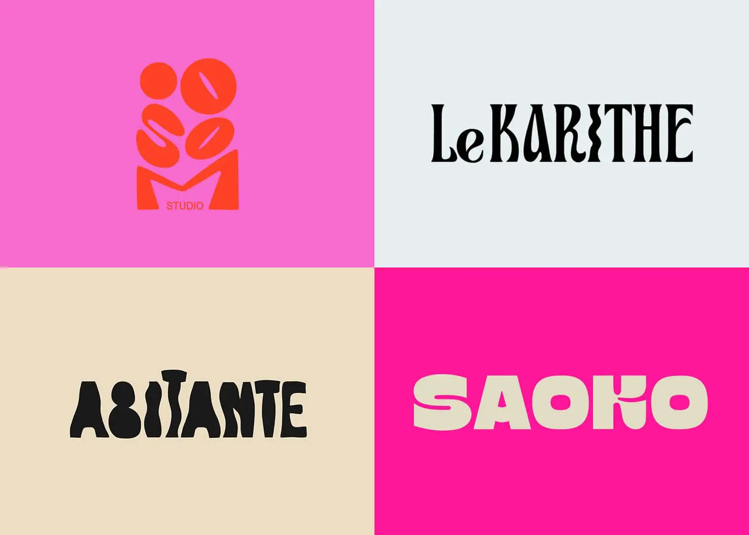
- Bold Experimental Typography
Short description – logos built around expressive, custom, or distorted type.
Visual style – oversized letters, stretched forms, unexpected spacing.
Example use cases – fashion brands, creative studios, music platforms.
Why it works in 2026 – typography-led logos feel confident and original, a key part of modern logo styles that stand out instantly.
- Minimal with Personality
Short description – clean logos that still feel human and distinctive.
Visual style – simple shapes paired with subtle quirks or details.
Example use cases – tech startups, wellness brands, lifestyle products.
Why it works in 2026 – audiences still love minimalism, but now expect warmth and character, not cold simplicity.
- Motion-Ready Logos
Short description – logos designed to move from the start.
Visual style – animated elements, transitions, looping effects.
Example use cases – apps, video intros, social media content.
Why it works in 2026 – motion grabs attention fast and fits perfectly into digital-first branding and short-form content.
- AI-Assisted Design Aesthetics
Short description – logos influenced by AI-generated forms and patterns.
Visual style – abstract shapes, unexpected symmetry, generative layouts.
Example use cases – tech, SaaS, innovation-driven brands.
Why it works in 2026 – AI expands creative exploration, inspiring fresh and unconventional logo visuals when guided by a strong design sense.
- Gradient Revival
Short description – gradients are back, but more refined.
Visual style – smooth blends, soft color transitions, depth effects.
Example use cases – digital products, fintech, media brands.
Why it works in 2026 – modern screens handle color beautifully, which makes gradients a powerful way to add emotion and dimension.
- Hand-Crafted Elements
Short description – logos that feel drawn, imperfect, and personal.
Visual style – handwritten type, sketch lines, organic textures.
Example use cases – food brands, creators, local businesses.
Why it works in 2026 – in an AI-heavy world, handmade details feel authentic and human, and come from a strong creative logo idea.
- Geometric Abstraction
Short description – logos built from simple geometric forms with abstract meaning.
Visual style – circles, grids, sharp lines, symbolic shapes.
Example use cases – architecture, tech, consulting brands.
Why it works in 2026 – geometry feels timeless, scalable, and globally readable across cultures and platforms.
- High-Contrast Color Systems
Short description – bold color pairings designed for impact.
Visual style – strong contrasts, dark/light combinations, vibrant accents.
Example use cases – e-commerce, entertainment, youth-focused brands.
Why it works in 2026 – high contrast improves accessibility and visibility, especially on mobile and social platforms.
How Brands Can Apply These Trends
Keeping up with branding trends 2026 doesn’t mean chasing every new logo style that appears. The goal isn’t to be trendy, it’s to be relevant. Brands that apply trends thoughtfully are the ones that build long-term recognition and not short-term hype.
Choose the right style for your brand
Start with your brand’s personality, values, and industry. A bold, experimental logo might work perfectly for a creative studio but feel out of place for a legal or financial brand. Trends should support your message, not compete with it.
Avoid trend overload
Trying to combine too many ideas at once can weaken a logo. Instead of stacking multiple trends together, focus on one or two that truly fit your brand. Simplicity helps logos stay clear, adaptable, and easier to remember.
Match the logo to your audience
Think about who your brand is speaking to and where they’ll see your logo most often. Younger, digital-native audiences may respond well to motion, bold typography, or high-contrast colors. More traditional audiences may prefer minimal and refined designs. The best logos meet the audience where they already are.
When used with intention, logo trends become tools, not distractions, which helps brands stay modern, recognizable, and ready for the future.
Mistakes to Avoid With Trend‑Based Logos
Trends can be powerful, but when used the wrong way, they can quickly weaken a brand’s identity. If the goal is future logo design, it’s important to think beyond what looks popular right now and focus on what will still work years from today.
- Chasing trends blindly – jumping on every new design trend without strategy often leads to logos that feel generic or outdated fast. Trends should inspire direction, not dictate the entire design. A strong logo still needs a clear concept and brand meaning behind it.
- Ignoring scalability – a logo might look great on a website header, but fall apart when used as a social media icon or app logo. Future-ready logos must stay clear and recognizable at every size, from tiny favicons to large-scale visuals.
- Poor contrast and legibility – low contrast colors, thin typography, or overly complex details can hurt readability, especially on mobile screens. If people can’t recognize or read a logo instantly, it fails its most basic job.
Avoiding these mistakes helps brands create logos that don’t just follow trends, but use them wisely to build lasting visual identity.
FAQs
What is the biggest logo trend in 2026?
The biggest logo trend in 2026 is adaptive and responsive logos, designs that change and simplify to work perfectly across all digital platforms and screen sizes.
Are minimalist logos still popular?
Yes, minimalist logos are still popular because they’re simple, versatile, and easy to recognize across different platforms.
How often should a brand update its logo?
A brand should update its logo every 5 to 10 years or when it needs to stay relevant with changing trends and audience expectations.
Do logo trends affect brand trust?
Yes, logo trends can affect brand trust by making a brand appear modern and reliable, or outdated and disconnected, depending on how well the logo fits its audience and industry.