15 Iconic Movie Posters Of All Time
Before anyone ever buys a ticket, a movie poster creates the first imperssion. In a single image, it has to grab attention, spark curiosity, and promise an experience worth watching. A great poster does more than just advertising a film. It shapes how audiences feel about it. From packed theater lobbies to streaming thumbnails, posters influence perception, fuel anticipation, and even impact box office sales long before the opening credits roll.
The most memorable designs master the art of visual storytelling, blending strong branding with raw emotional impact. It can be a minimalist composition, an unforgettable character pose, or a striking use of color and typography, all these posters become cultural symbols that outlive the movies themselves.
In this article, 15 iconic movie posters of all time, you’ll discover what makes these designs legendary, and why they continue to inspire filmmakers, designers, and movie lovers decades later.
Why Movie Posters Matter
Movie posters do a lot more than just promote a film. Iconic movie posters are often the very first thing people see, and that first glance can decide everything. Through smart use of colors, images, and design, posters tap into marketing psychology by instantly creating a feeling, excitement, mystery, fear, or nostalgia, before we even know the story.
First impressions are powerful. A great poster makes a movie feel important, memorable, and worth watching. It helps the film stand out in a sea of choices and builds recognition that sticks with audiences over time.
At their best, movie posters are a form of visual storytelling in cinema. They give us a snapshot of the film’s world, hint at its mood, and tease the story without revealing too much. When all of that comes together, a poster doesn’t just advertise a movie, it becomes part of its legacy
The 15 Iconic Movie Posters
Below are 15 famous film posters that shaped cinema marketing and pop culture. Each one proves how powerful design can be when storytelling and emotion are combined.
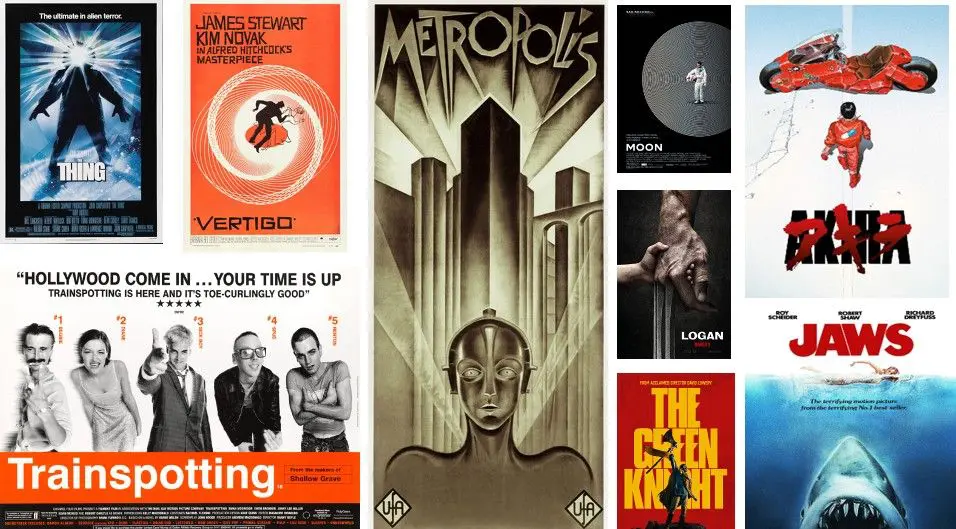
- Jaws (1975)
- Designer – Roger Kastel
- Visual – massive shark rising toward an unaware swimmer
- Design breakdown – minimal colors (blue, white, red), clean typography, dramatic scale
- Why it’s iconic – pure fear in one image, it told the entire story without spoilers.
- Star Wars: A New Hope (1977)
- Designer – Tom Jung
- Visual – heroic characters posed in a myth-like composition
- Design breakdown – bold colors, dramatic lighting, fantasy-style layout
- Why it’s iconic – it made sci-fi feel epic, heroic, and timeless.
- The Godfather (1972)
- Designer – S. Neil Fujita
- Visual – puppet hand holding strings
- Design breakdown – black-and-white palette, sharp serif typography, lots of negative space
- Why it’s iconic – simple, powerful, and instantly recognizable.
- Pulp Fiction (1994)
- Designer – Indika Entertainment Advertising
- Visual – Uma Thurman lounging with a cigarette
- Design breakdown – retro colors, pulp-magazine typography, bold framing
- Why it’s iconic -perfectly matched the film’s edgy, cool tone.
- Jurassic Park (1993)
- Designer – Chip Kidd
- Visual – dinosaur skeleton logo
- Design breakdown – red, black, and yellow contrast, strong logo-first layout
- Why it’s iconic – proved that a logo alone can sell a movie.
- Vertigo (1958)
- Designer – Saul Bass
- Visual – stylized figures falling into a spiral
- Design breakdown – flat colors, abstract shapes, hand-drawn typography
- Why it’s iconic – a masterclass in visual storytelling and emotion.
- Titanic (1997)
- Designer – Crew Creative Advertising
- Visual – Jack and Rose with the ship behind them
- Design breakdown – soft blue tones, romantic composition, elegant typography
- Why it’s iconic – captured love, scale, and tragedy in one image.
E.T. the Extra-Terrestrial (1982)
- Designer – John Alvin
- Visual – a glowing fingertip touch
- Design breakdown – dark background, glowing light, minimal text
- Why it’s iconic – emotional, magical, and instantly recognizable
- The Dark Knight (2008)
- Designer – BLT Communications
- Visual – Batman with a burning bat symbol
- Design breakdown – cold blues, gritty textures, modern typography
- Why it’s iconic – redefined the look of superhero posters.
- Psycho (1960)
- Designer – Saul Bass
- Visual – broken text and fragmented layout
- Design breakdown – stark black-and-white, sharp lines, unsettling design
- Why it’s iconic – it made audiences uneasy before the movie even started.
- Fight Club (1999)
- Designer – Art Machine
- Visual – pink soap bar with the title engraved
- Design breakdown – high contrast, unexpected color choice, bold typography
- Why it’s iconic – subversive and symbolic, just like the film.
- Alien (1979)
- Designer – Philip Gips
- Visual – cracked egg floating in darkness
- Design breakdown – minimal text, eerie green glow, slow-burn layout
- Why it’s iconic – built suspense through mystery.
- Back to the Future (1985)
- Designer – Drew Struzan
- Visual – Marty checking his watch beside the DeLorean
- Design breakdown – hand-painted style, warm colors, dynamic pose
- Why it’s iconic – adventure, humor, and time travel in one frame.
- The Silence of the Lambs (1991)
- Designer – Dawn Baillie
- Visual – a moth covering a woman’s mouth
- Design breakdown – muted tones, unsettling symbolism, centered layout
- Why it’s iconic – creepy, clever, and unforgettable.
- Casablanca (1942)
- Designer – Bill Gold
- Visual – romantic montage of characters
- Design breakdown – illustrated style, classic typography, dramatic lighting
- Why it’s iconic – old Hollywood romance at its finest.
Common Design Patterns in Iconic Posters
When you look closely at the best movie poster designs, clear patterns start to appear. No matter the genre or era, iconic posters tend to follow a few smart design rules that make them instantly memorable and easy to understand.
Typography hierarchy is one of the most important elements. The movie title is usually the star, supported by smaller text for names and taglines. Clean, readable type helps guide the viewer’s eye and makes the poster easy to scan in just a few seconds.
Color psychology also plays a big role. Dark tones often signal suspense or danger, warm colors suggest romance or adventure, and high-contrast palettes create drama. The right colors trigger emotions before a single word is read.
Another key pattern is the balance between minimalism and detail. Some posters use very little, one image, one symbol, to spark curiosity. Others pack in detail to show scale and world-building. Both approaches work when they match the film’s tone.
Finally, strong composition and clear focal points make posters effective. The eye is always drawn to one main element first, whether it’s a character, symbol, or moment. That clarity is what separates ordinary posters from designs that become timeless.
Lessons Designers Can Use Today
When you look at legendary movie artwork, one thing becomes clear. The best designs don’t try too hard. They know exactly what they want to say, and say it fast.
A huge lesson is branding impact. Iconic posters stick in your head because they have a clear and recognizable look. One image, one style, one feeling. That kind of consistency makes a brand memorable long after the first glance.
Another big takeaway is how posters use emotion. Fear, love, excitement, mystery, and legendary designs trigger feelings instantly. If a design makes someone feel something, they’re far more likely to remember it.
Simplicity is also key. Many classic posters rely on a single strong idea instead of cramming in details. Less clutter means a clearer message and stronger impact.
Finally, these designs follow timeless layout principles. Clean composition, clear focus, and smart spacing never go out of style. Trends come and go, but good structure lasts, which is exactly why legendary movie artwork still feels powerful today.
FAQs
- What makes a movie poster iconic?
Classic cinema posters become iconic when it clearly captures a film’s mood, story, and emotion in one powerful image.
- Who designs movie posters?
Movie posters are usually designed by professional graphic designers or artists who specialize in marketing and visual storytelling for films. Sometimes, famous illustrators or design studios are hired to create standout posters.
- How do movie posters affect marketing?
Movie posters grab attention, create interest, and shape how people feel about a film. This makes them a key part of marketing that helps drive ticket sales and build a movie’s brand.
- Are minimalist posters more effective?
Yes, minimalist posters can be more effective because they focus on a clear and strong message that’s easy to understand and remember quickly.