A truly effective luxury logo has a way of communicating value before a single word is read. Some logos instantly feel ‘expensive’ because they rely on subtle visual cues – clean lines, balanced proportions, refined typography, and intentional simplicity.
Unlike overly complex designs, high-end branding often embraces restraint, allowing every detail to feel deliberate and elevated. This sense of effortlessness is what signals exclusivity and quality at first glance.
The psychology behind luxury branding plays a major role in this perception. Premium brands are not just selling products. They’re selling aspiration, status, and emotion. A well-crafted luxury logo taps into these feelings through elements like minimalism, symmetry, and carefully chosen color palettes such as black, gold, or muted tones. These choices subconsciously communicate sophistication, trust, and timelessness, which makes the brand feel more desirable and prestigious.
Let’s find out what truly defines a luxury logo by breaking down the core elements behind premium design. From typography and spacing to color and symbolism, each component works together to create a cohesive identity that stands out in a crowded market while maintaining an air of exclusivity.
What Defines a Luxury Logo?
A strong luxury logo is all about high-end branding that feels effortless and refined. Instead of trying too hard to stand out, luxury brands keep things simple and let the quality speak for itself.
Simplicity and restraint are key. Luxury logos don’t include too many elements or unnecessary details. They focus on clean shapes, balanced layouts, and a polished look. This makes the brand feel more confident and premium.
That’s where confidence in minimalism comes in. High-end brands don’t need loud designs or flashy effects to get attention. A simple logo, when done right, can feel much more powerful and elegant. Every small detail matters, from the spacing to the font choice.
Another important factor is timelessness. A luxury logo should look just as good years from now as it does today. That’s why these brands avoid trends and stick to classic design styles that don’t go out of fashion.
In the end, a luxury logo works because it’s simple, thoughtful, and built to last. Exactly what high-end branding is all about.
Key Elements of a Luxury Logo
Minimalist Design
One of the most important parts of a strong luxury logo design is minimalism. High-end brands don’t rely on complicated visuals. Instead, they focus on keeping everything clean, simple, and intentional.
Clean lines are a big part of this. Straightforward shapes and smooth edges make a logo feel polished and professional. Nothing looks messy or random, every line has a purpose.
Another key element is the use of negative space. This means using the empty space around or within a design in a smart way. It helps the logo breathe, look more balanced, and often adds a subtle creative touch without making it feel crowded.
Most importantly, there are no unnecessary details. Luxury logos avoid extra decorations, effects, or clutter. If something doesn’t add real value to the design, it’s left out. This simplicity is what makes the logo feel more elegant and high-end.
Elegant Typography
Typography plays a huge role in how a brand is perceived, and in luxury branding, it’s often the main focus. Strong luxury typography can make even the simplest logo feel refined, premium, and memorable.
One of the most common choices is serif fonts. These fonts have small lines or strokes at the ends of letters, which give them a classic and sophisticated look. That’s why many luxury brands use them. They feel timeless and trustworthy.
Another important detail is the use of custom letterforms. Instead of using standard fonts, many high-end brands tweak or fully design their own lettering. This makes the logo unique and instantly recognizable, and adds a sense of exclusivity.
Finally, there’s spacing and kerning precision. This refers to the space between each letter. In luxury typography, spacing is carefully adjusted so everything looks perfectly balanced. Even small changes can make a big difference, helping the logo feel clean, elegant, and well-crafted.
Refined Color Palette
Color is one of the most recognizable elements of a luxury logo, and high-end brands are very intentional about how they use it. Instead of bright or overwhelming combinations, luxury logos stick to a refined and controlled palette:
- Black, white, gold, and silver
These are the most classic luxury colors. Black and white create a clean, timeless base. Gold and silver add a sense of prestige, wealth, and exclusivity.
- Deep jewel tones
Colors like emerald green, navy blue, burgundy, and deep purple are often used to add richness without being too loud. They feel elegant and sophisticated rather than flashy.
- Limited color usage
Luxury logos usually don’t use many colors at once. Keeping the palette minimal makes the design feel more polished and high-end, while also making it easier to recognize.
Balanced Composition
A well-structured layout is essential in creating minimalist luxury logos. Balance makes a logo feel calm, polished, and visually pleasing, without it, even a simple design can feel off. Here are the key aspects of balanced composition:
- Symmetry
Symmetrical designs naturally feel more stable and refined. When elements are evenly distributed, the logo looks more professional and easier to recognize.
- Proportional spacing
Every element in a luxury logo should have the right amount of space around it. Nothing should feel too tight or too far apart. Proper spacing helps the design breathe and keeps it looking clean.
- Visual harmony
All parts of the logo should work together smoothly. Fonts, shapes, and spacing need to feel consistent and connected, creating a unified and elegant look.
Premium Materials (Brand Application)
A logo alone isn’t enough. How it looks in real life also matters. In a premium brand identity, the materials and finishes used can make a simple design feel much more high-end.
Foil stamping adds a shiny metallic effect, usually in gold or silver. It instantly makes things like packaging or business cards look more expensive and eye-catching.
Embossing gives the design a raised texture. You can actually feel it when you touch it, which adds a nice, subtle detail and makes the brand feel more premium.
Matte finishes are also very common. Instead of being shiny, they have a soft, smooth look that feels more elegant and modern. They also help other details, like foil or embossing, stand out more.
All of these small touches help turn a simple logo into a full, premium brand identity that looks and feels more luxurious.
The Psychology Behind High-End Branding
Understanding what makes a logo look expensive is about more than just design. It’s also about how people feel when they see it. Luxury logos tap into psychology to create a sense of value and desire.
- Exclusivity
Luxury brands make people feel like they’re part of a select group. A logo that looks exclusive signals that the brand isn’t for everyone, which makes it more desirable.
- Scarcity
Limited availability adds value. When something feels rare, it automatically seems more precious. A well-designed luxury logo can give that impression of scarcity even before someone buys the product.
- Authority & trust
Premium brands project confidence and reliability. A logo that looks polished, balanced, and professional helps build trust and positions the brand as an authority in its field.
- Emotional aspiration
Luxury logos appeal to what people want to feel – success, sophistication, and prestige. By triggering these emotions, a logo can create a strong connection and make the brand feel aspirational.
Common Mistakes That Ruin a Luxury Look
Even small missteps can make a luxury logo feel cheap instead of high-end. Here are some common mistakes to avoid:
- Overdesigning – adding too many elements can make the logo look cluttered and cheap.
- Too many colors – luxury logos usually stick to a simple, refined palette. Too many colors feel overwhelming.
- Trend-chasing – following every design trend can make a logo feel temporary rather than timeless.
- Poor typography choices – using the wrong font or spacing can ruin the elegance and sophistication of the design.
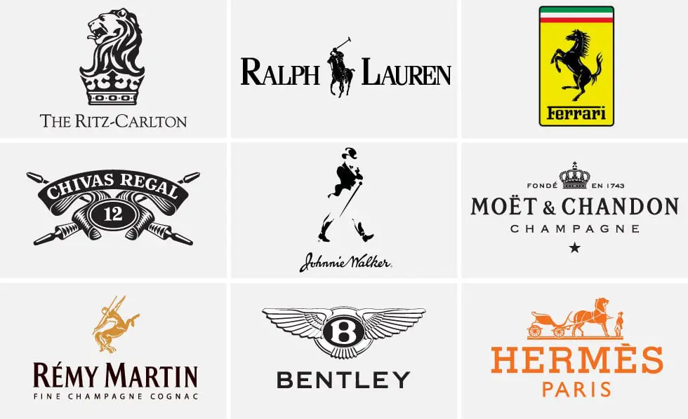
Luxury Logos Across Industries
Luxury branding appears in many industries, and the use of luxury logo colors helps create a consistent high-end feel:
- Fashion – black, white, and gold are common to convey elegance and exclusivity.
- Hospitality – deep jewel tones and muted shades suggest comfort, sophistication, and premium service.
- Jewelry – metallics like gold and silver highlight quality and prestige.
- Automotive – dark, bold colors with minimal accents create a sense of power and luxury.
- Beauty & skincare – soft neutrals or refined metallics signal elegance, purity, and premium quality.
How to Create a Luxury Logo for Your Brand
Designing a luxury logo takes thought and careful planning. Here are the key steps:
- Define brand positioning – know what your brand stands for and the audience you want to attract.
- Choose typography carefully – select fonts that feel elegant, timeless, and unique.
- Limit visual elements – keep the design simple; avoid clutter or unnecessary details.
- Focus on spacing and balance – proper alignment and spacing make the logo look polished and professional.
- Test across packaging and digital – make sure the logo looks premium in every format, from business cards to websites.