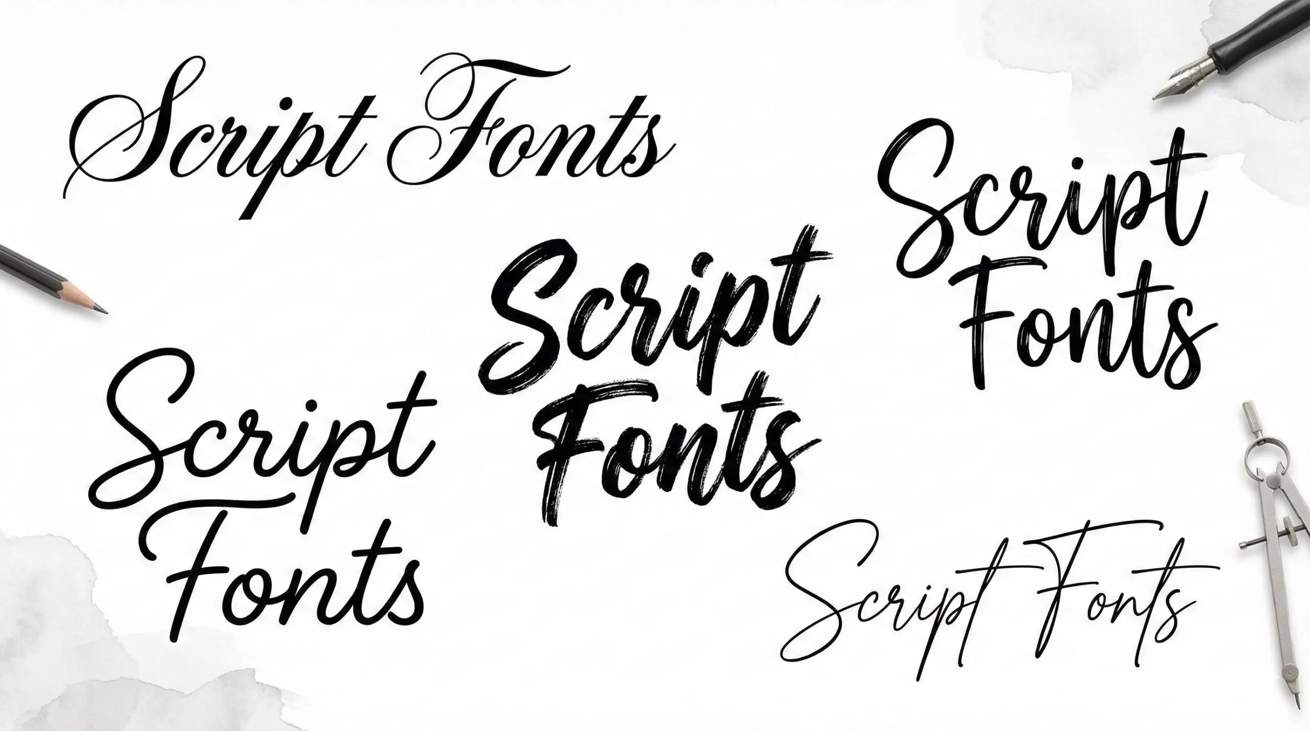
Script fonts can make a design feel elegant, personal, bold, or creative. But choosing the wrong one can quickly hurt readability and weaken your layout. That’s why understanding the different types of script fonts is important for any designer or brand builder.
In this guide, you’ll learn the main types of script fonts, their styles, how they differ from cursive, and when each type works best. We’ll also cover simple pairing tips so your typography looks intentional, not decorative.
What Are Script Fonts?
Script fonts are typefaces designed to look like handwriting. They are inspired by traditional calligraphy, where the way you hold and move a pen changes how letters appear. Digital script fonts recreate that handwritten feel in a format that can be resized and used on screens or in print.
Most script fonts have:
- Flowing or connected letters
- Visible direction in the strokes
- A mix of thick and thin lines
- Decorative details like swashes
- A natural rhythm across words
Unlike serif fonts, which focus on structure and clarity, or sans serif fonts, which aim for simplicity and readability, script fonts focus on movement and personality. They are more expressive and stylistic.
Many modern script fonts also include advanced features, like OpenType, that automatically adjust letter shapes to look more natural when placed next to certain characters.
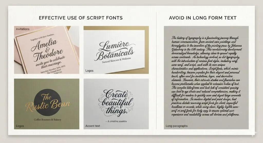
Because of their detail and movement, script fonts work best for headlines, logos, and short phrases. They are usually not a good choice for long paragraphs, where readability is more important than style.
Main Types of Script Fonts
Over time, script typography has developed into several clear categories. Each of the main types of script fonts has a different look, level of formality, and practical use in design.
Some styles feel elegant and traditional, while others are casual, bold, or expressive. They vary in stroke thickness, flow, decoration, and overall structure.
Understanding these differences makes it easier to choose a script font based on your message and brand tone, not just on what looks attractive.
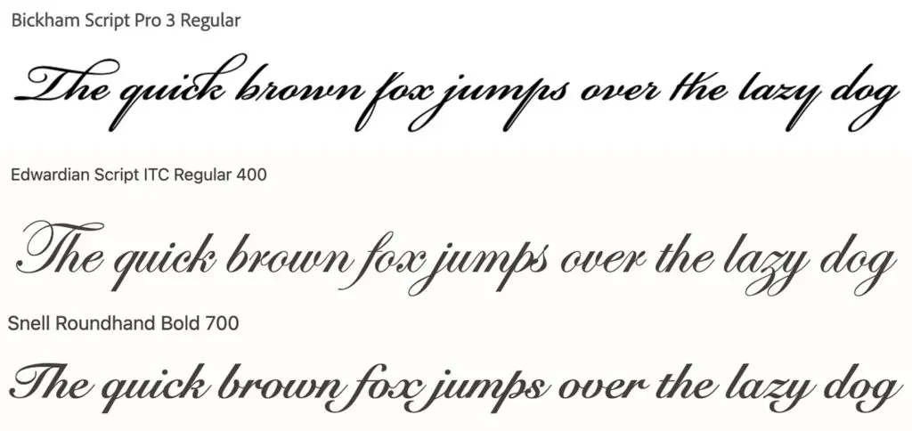
1. Formal Script Fonts (Calligraphy Fonts)
Formal script fonts are directly influenced by traditional calligraphy practices. These calligraphy fonts replicate disciplined pen strokes created with broad-nib or pointed pens.
Their defining characteristics include:
- High contrast between thick downstrokes and thin upstrokes
- Consistent pen angle simulation
- Structured letterforms with predictable rhythm
- Decorative swashes and flourished capitals
Examples include Bickham Script, Edwardian Script, and Snell Roundhand.
Best suited for:
- Wedding invitations
- Luxury branding
- Certificates and formal documentation
From a design perspective, formal script fonts communicate hierarchy and refinement. Their structured rhythm conveys tradition and authority. However, excessive scaling down reduces legibility due to stroke contrast compression.
These fonts require disciplined spacing and controlled usage within layouts.
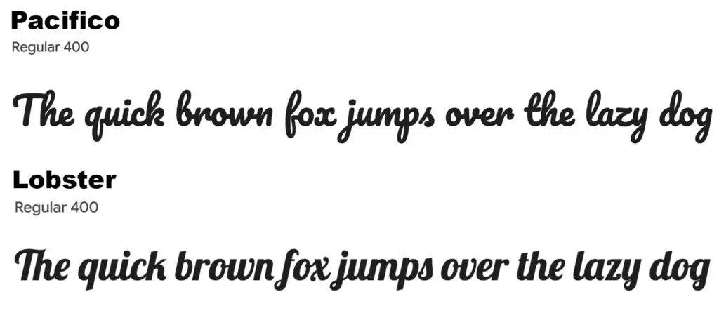
2. Casual Script Font Styles
Casual script font styles evolved as informal adaptations of traditional calligraphy. They retain the fluid nature of script while reducing structural rigidity.
Characteristics include:
- Lower stroke contrast
- Relaxed baseline flow
- Minimal ornamentation
- More spontaneous letterforms
Examples include Pacifico and Lobster.
When to use:
- Social media graphics
- Lifestyle brands
- Informal packaging systems
Casual script font styles communicate accessibility and warmth. Compared to formal calligraphy fonts, they are structurally simpler and slightly more adaptable in digital environments. However, they still function best in short-form text such as headings or accents.
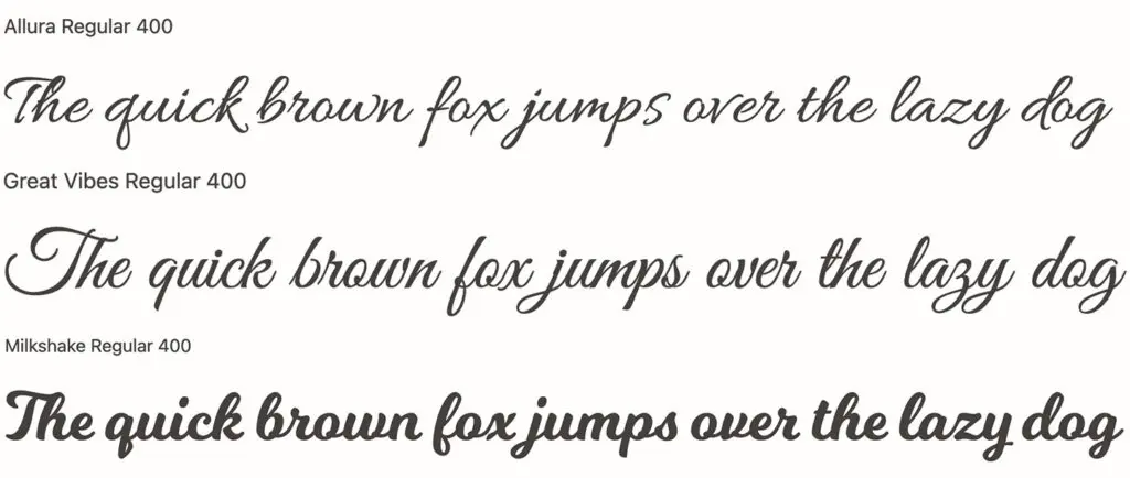
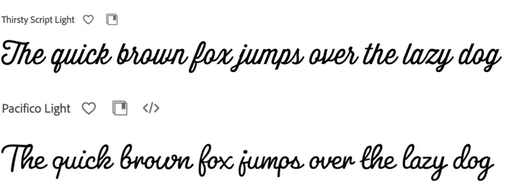
3. Modern Script Fonts
Modern script fonts reinterpret historical script forms within contemporary design systems. They simplify ornamentation and prioritize clarity while preserving curvature.
Key attributes:
- Minimal flourishes
- Balanced spacing
- Clean curves with moderated contrast
- Controlled stroke transitions
Unlike traditional calligraphy fonts, modern script fonts reduce decorative excess in favor of scalability.
Examples include Allura, Great vibes and Milkshake.
They are frequently applied in:
- Beauty branding
- Fashion identities
- Creative startups
Modern script fonts integrate effectively with sans-serif companions due to contrast in structure. Their restrained style allows them to function within digital-first branding systems without overwhelming hierarchy.
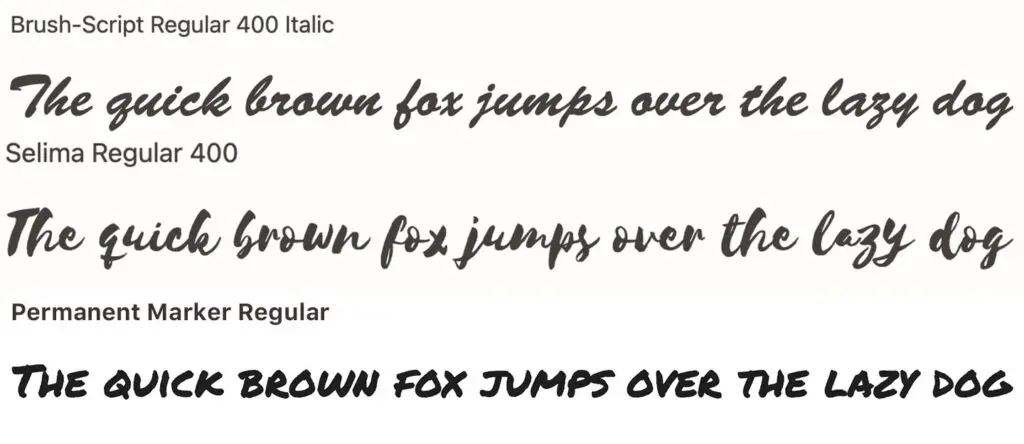
4. Brush Script Fonts
Brush script fonts simulate lettering created with paintbrushes or marker tools. Their construction emphasizes pressure dynamics rather than pen precision.
Structural elements include:
- Visible pressure variation
- Textured or irregular edges
- Energetic directional flow
- Organic stroke endings
Clean brush styles maintain smoother edges for digital clarity, while textured brush styles preserve visible grain.
Common applications:
- Posters
- Apparel graphics
- Creative brand campaigns
Brush script fonts introduce motion and intensity into compositions. Because of their visual weight and irregularity, they should be paired with neutral supporting typefaces to stabilize layout balance.
5. Handwritten Fonts
Handwritten fonts represent a more informal branch of script typography. Unlike formal script font styles, they intentionally preserve irregularities found in natural handwriting.
Their structural features include:
- Irregular baselines
- Uneven stroke widths
- Variable spacing
- Subtle inconsistencies between characters
Handwritten fonts differ from formal scripts in their lack of ornamental swashes and disciplined pen simulation.
Best used for:
- Journals and planners
- DIY branding
- Personal blogs
They communicate authenticity and immediacy. However, from a technical standpoint, they require readability testing at multiple sizes to ensure functional clarity.
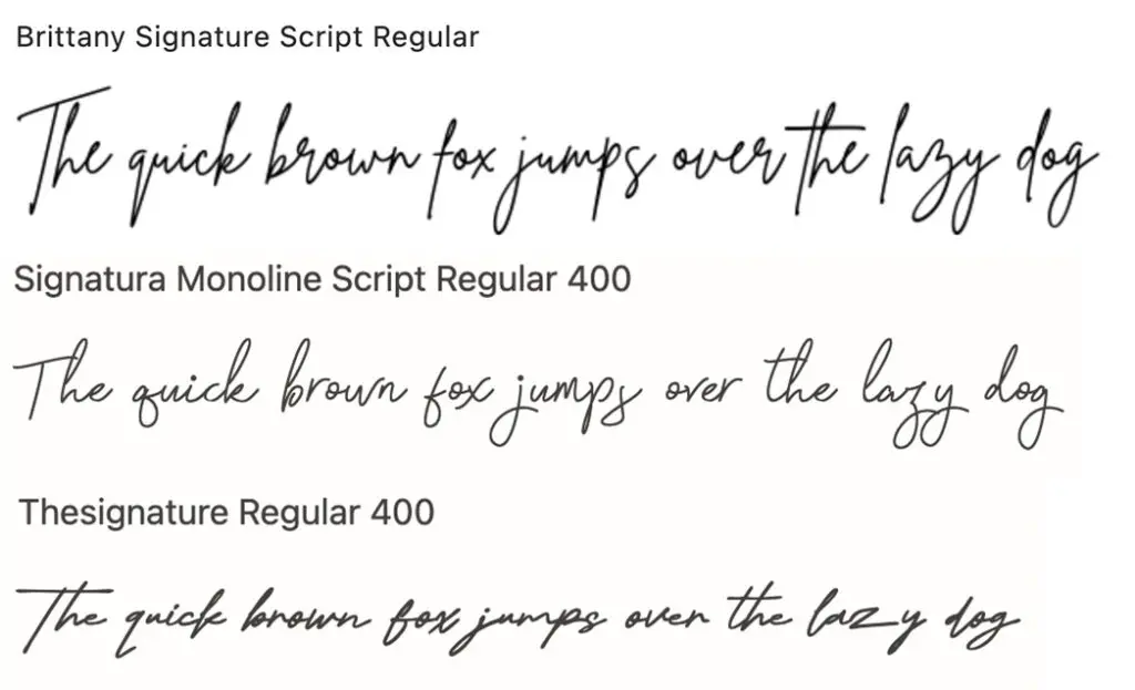
6. Signature Script Fonts
Signature script fonts replicate the appearance of handwritten signatures. They prioritize individuality over structural symmetry.
Common traits:
- Thin, consistent strokes
- Slight rightward slant
- Partial letter disconnection
- Minimal decorative elements

Best suited for:
- Photography logos
- Personal branding
- Creative portfolios
Signature scripts communicate exclusivity and refined minimalism. Because of their light weight, they demand strong background contrast and careful spacing within brand systems.
7. Vintage Script Fonts
Vintage script fonts are retro-inspired styles influenced by mid-20th-century lettering. They often reference 1950s signage and hand-painted advertisements, featuring bold curves, rounded terminals, and strong horizontal flow. Unlike formal calligraphy fonts, they reflect brush and sign-painting techniques rather than pen precision.
Common influences include diner signage, storefront windows, and classic packaging design.
Best use cases:
- Coffee shops
- Craft brands
- Heritage businesses
Nostalgia is the primary driver behind vintage script fonts. They evoke familiarity, craftsmanship, and legacy positioning. When applied carefully, they help anchor a brand in tradition while maintaining visual clarity within modern layouts.
Comparison of Different Script Font Styles
Type | Level of Formality | Best Use | Legibility Level | Emotional Tone |
Formal Script | High | Invitations, luxury brands | Moderate | Refined, traditional |
Casual Script | Medium | Social media, lifestyle | Moderate | Friendly, accessible |
Modern Script | Medium | Fashion, beauty | High | Contemporary, balanced |
Brush Script | Low to Medium | Posters, apparel | Moderate | Dynamic, expressive |
Handwritten | Low | Blogs, DIY | Moderate | Personal, informal |
Signature Script | Medium | Personal logos | Moderate | Sophisticated, minimal |
Key Takeaways:
- Formality matters. Some types of script fonts feel elegant and traditional, especially formal and calligraphy styles. Others, like handwritten and brush scripts, feel relaxed and creative. Choose a level of formality that matches your brand.
- Readability depends on detail. Fonts with heavy decoration or strong contrast are harder to read at small sizes. Cleaner modern script fonts are usually easier to use in digital designs.
- Use depends on context. Formal scripts work well for invitations and luxury brands. Brush scripts suit posters and bold graphics. Handwritten and signature styles fit personal brands and creative projects.
- Style affects emotion. Thick and thin contrast with decorative swashes feels refined. Irregular lines and textured strokes feel natural and informal.
- Best for short text. Script fonts are strongest in logos, headlines, and short phrases. They are not ideal for long paragraphs.
These distinctions allow graphic designers to evaluate script font styles analytically rather than stylistically, ensuring consistency, clarity, and strategic alignment within a typographic system.
Script vs Cursive Fonts: Key Differences Explained
Cursive refers specifically to a style of connected handwriting in which letters flow continuously. Script fonts are a broader typographic category inspired by handwriting and calligraphy traditions.
While cursive writing is inherently connected, script fonts may include both connected and partially disconnected letterforms.
For example:
- A formal calligraphy font may contain elaborate swashes that extend beyond standard cursive behavior.
- A handwritten script may mimic cursive rhythm while allowing slight letter separation.
In summary, cursive describes writing behavior. Script describes typographic classification. This distinction clarifies selection criteria when evaluating script font styles.
When to Use Script Fonts in Graphic Design
Determining when to use script fonts requires evaluating both brand tone and functional readability.
Define brand positioning.
Script typography aligns with brands emphasizing elegance, creativity, or personal identity.
Assess readability constraints.
Script fonts should be limited to short-form elements such as:
- Headlines
- Logos
- Accent text
- Invitations
Avoid long-form paragraphs due to reduced reading efficiency.
Evaluate scale and hierarchy.
Thin strokes require sufficient size and contrast to remain legible.
Industries where script fonts function effectively include:
- Event and wedding design
- Beauty and fashion
- Food and beverage
- Personal branding
Applying script fonts selectively preserves typographic hierarchy and prevents visual fatigue.
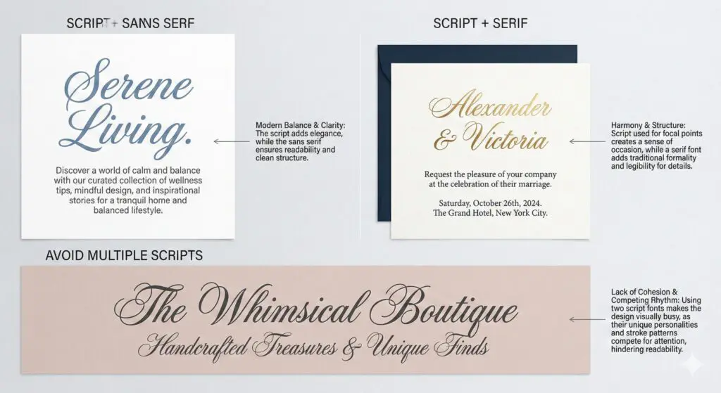
How to Pair Script Fonts with Other Fonts
Effective pairing depends on structural contrast.
Script + Sans Serif:
Provides modern balance. The simplicity of sans-serif typefaces stabilizes expressive script forms.
Script + Serif:
Supports formal layouts. A restrained serif can complement calligraphy fonts without visual conflict.
Avoid pairing multiple script fonts within a single layout. Competing curves and stroke rhythms disrupt cohesion.
Weight contrast and proportional balance should guide pairing decisions. The supporting typeface must enhance clarity without competing for attention.
Ready to Elevate Your Design Work?
If you want reliable, high-quality design without hiring freelancers or an in-house team, Buzzcube’s unlimited graphic design service can help. For one monthly fee, you get unlimited design requests and revisions, fast turnaround, and a dedicated designer who learns your brand needs.
Use it for logos, social media graphics, posters, brand assets, and more, so your layouts always match your vision. Schedule a free consultation.
Frequently Asked Questions
What are the main types of script fonts?
The main types include formal script, casual script, modern script, brush script, handwritten fonts, and signature scripts.
What is the difference between script vs cursive fonts?
Cursive refers to connected handwriting. Script fonts are a broader typographic category inspired by handwriting and calligraphy traditions.
Are calligraphy fonts the same as script fonts?
Calligraphy fonts are a subset of script fonts that specifically replicate traditional pen calligraphy.
When should you use script fonts?
Script fonts should be used for logos, headlines, invitations, and accent elements where expressive typography is required.
Are script fonts good for logos?
Yes, when aligned with brand tone and supported by clear hierarchy and spacing.
Can handwritten fonts be used professionally?
Yes, provided readability and brand positioning are evaluated carefully.