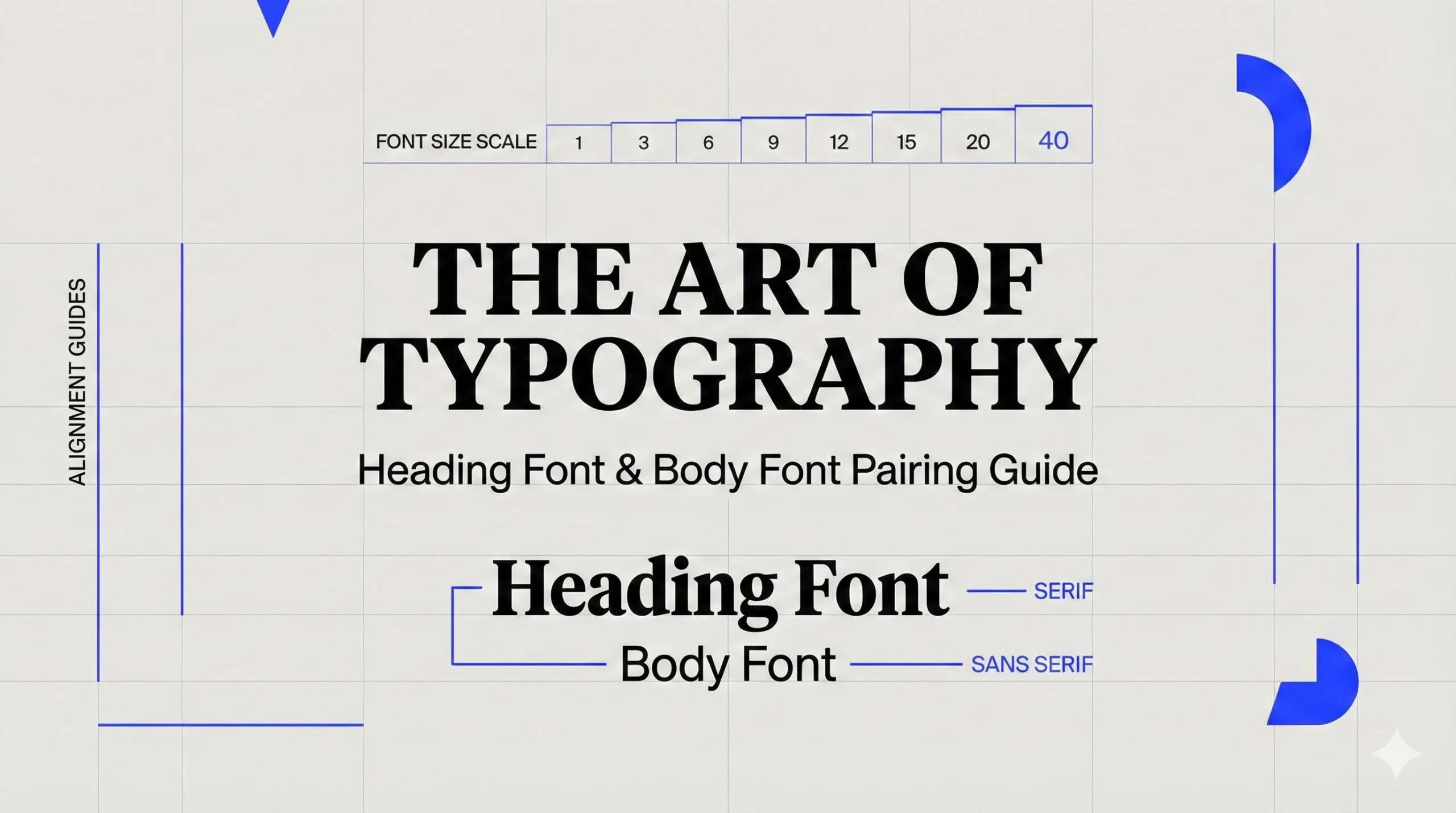
You choose two beautiful font pairings. You place them together. Something feels off.
The headings overpower the body text. The hierarchy looks confusing. The design feels slightly amateur, even though each typeface looked great on its own.
This is a common frustration in design. Great typography is not about collecting stylish fonts. It is about making them work together. Effective font pairing is what separates polished, professional layouts from cluttered ones.
In this guide, you will learn a repeatable system. Not just a list of combinations. You will get a practical framework, evaluation tools, curated examples, and real-world use cases for websites, logos, branding systems, and presentations.
What Is Font Pairing and Why Does It Matter in Modern Design
Font pairing is the intentional selection of two or more typefaces that work together within a single design system to create hierarchy, clarity, and visual harmony.
Its purpose is to:
- Establish a clear hierarchy between headings, subheadings, and body text
- Improve readability and scanning
- Reinforce brand personality and tone
- Increase trust and perceived professionalism
Typography shapes how users interpret content. Poor font pairing reduces usability and weakens brand perception. Strong pairing improves comprehension and strengthens credibility.
It applies across:
- Branding systems
- Website and UI design
- Print materials
- Presentations
- Resumes and portfolios
In modern design, typography is not decoration. It is structure.
How to Choose Font Pairing: 3-Steps
If you want a repeatable method for how to choose font pairing, follow this sequence every time.
Define Each Font’s Role Before You Pick Anything
Before browsing fonts, define roles.
There are four common roles:
- Display – Large headlines or hero sections
- Body – Paragraph text
- UI / Functional – Buttons, labels, navigation
- Accent – Occasional emphasis
Most projects only need two roles: headline and body.
Start by choosing the body font first. It carries the most content and determines readability.
Example scenario: Blog layout
- Body: A readable serif at 16px
- Headings: A clean sans serif with stronger weight
The body font sets tone and usability. The heading font creates structure.
Never choose both at once. Define purpose first.
Create Contrast Without Creating Conflict
Contrast makes hierarchy clear. Conflict makes design chaotic.
Use these contrast levers:
- Serif vs sans
- Weight differences
- Width differences
- Size hierarchy
- Texture and personality
Avoid fonts that are too similar. Two geometric sans fonts with similar proportions often clash subtly.
Rule of thumb:
If fonts belong to the same category, adjust at least two contrast variables. For example, combine a condensed bold sans for headings with a regular wide sans for body.
Contrast should feel intentional, not accidental.
Check Compatibility in 60 Seconds
Before committing, run a quick compatibility check:
- Do the x-heights feel balanced?
- Are apertures similarly open or intentionally contrasted?
- Is stroke contrast harmonious?
- Does the rhythm feel consistent in paragraphs?
- Are italics and multiple weights available?
- Does it support the required languages?
This simple evaluation prevents the most common mistakes.
Think of it as a final quality filter.
The Formula for a Perfect Font Pairing
A perfect font pairing does not mean trendy. It means balanced.
Use this 10-point scoring system:
- Readability (0–2)
- Hierarchy clarity (0–2)
- Mood alignment (0–2)
- Compatibility (0–2)
- Practicality (0–2)
A score of 8 or higher indicates a strong, reliable pairing.
Example: Playfair Display + Archivo
- Readability: 2
- Hierarchy clarity: 2
- Mood alignment: 2
- Compatibility: 1
- Practicality: 2
Total: 9/10
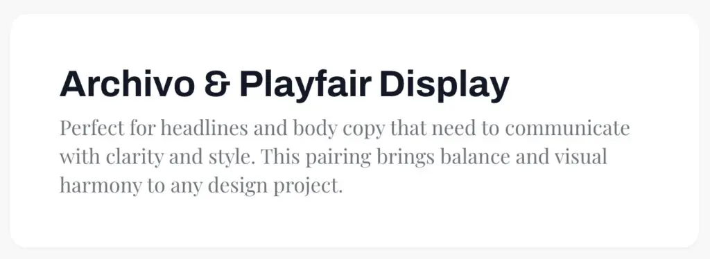
Why it works: High contrast serif headlines paired with a neutral sans body creates clarity and elegance without sacrificing usability. Use scoring to remove guesswork.
Typography Pairing Guide: Core Principles Every Designer Should Follow
This guide to typography pairing outlines principles that consistently produce strong results for graphic designers.
Use Fewer Fonts Than You Think
Two font families are usually enough.
Many professional systems rely on:
- One display or headline font
- One body/UI font
Superfamilies are a safe option. They offer serif and sans versions with shared DNA, reducing compatibility risks.
Make Hierarchy Obvious
Users scan before they read.
Use:
- Clear size ratios such as 1.25x or 1.5x scale
- Weight differences between headings and body
- Adequate spacing
Online, clarity beats subtlety.
Align Mood and Brand Personality
Script and display fonts should be used sparingly. They are accents, not systems.
Define tone words first. Then match typography.
Consider Accessibility and Performance
Avoid:
- Thin weights for small text
- Condensed fonts for long paragraphs
For web:
- Limit font files
- Reduce weight variations
- Consider variable fonts
Variable fonts allow multiple weights in a single file, improving performance.
Accessibility and speed are design decisions, not technical afterthoughts.
Best Font Combinations (Curated by Use Case, Not Just Style)
Below are curated best font combinations, organized by practical application.
Editorial / Blog
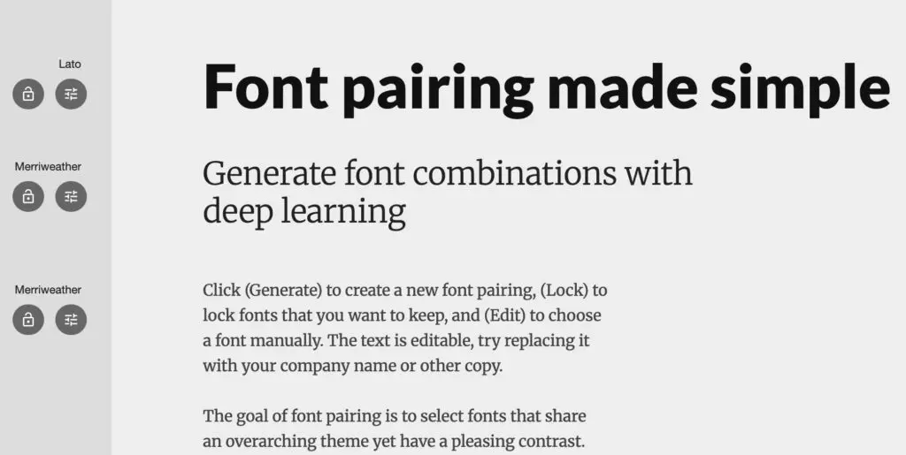
Merriweather + Lato
- Use case: News or educational blogs
- Why: Both optimized for screens, good x-height alignment
- Tip: Use Merriweather Bold for section headers
SaaS / Product UI
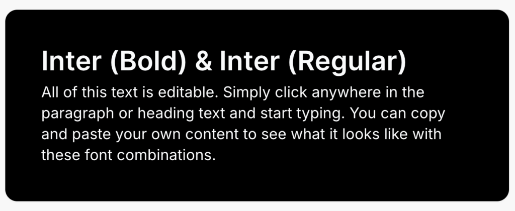
Inter + Inter
- Use case: Full UI systems
- Why: Superfamily consistency
- Tip: Use weight contrast, not font changes
Luxury Brand
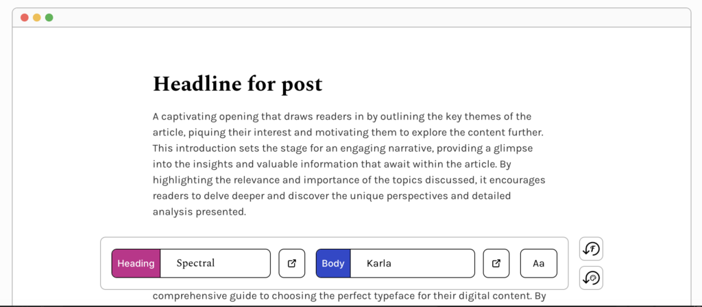
Spectral + Karla
- Use case: Luxury editorial, storytelling brands
- Why: Spectral delivers refined, editorial serifs; Karla’s simple sans gives breathable support.
- Tip: Use medium Spectral for subheadings to enhance hierarchy.
Creative Portfolio
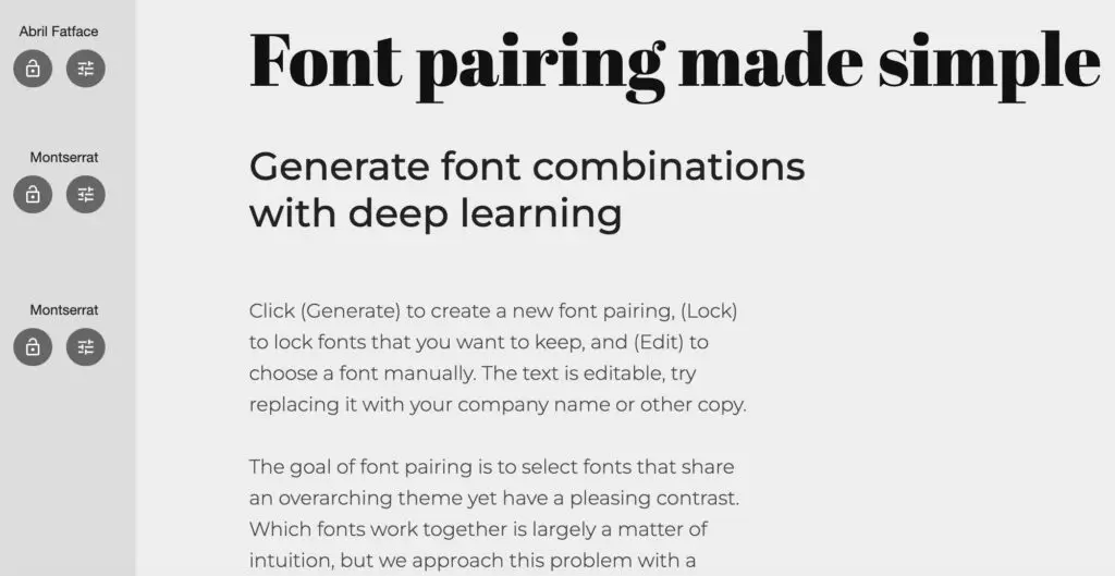
Abril Fatface + Montserrat
- Use case: Personal portfolio
- Why: Bold personality + clean support
- Tip: Use the display font only in large sizes
Presentation
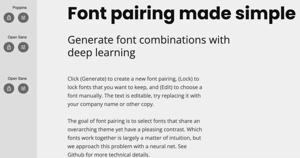
Poppins + Open Sans
- Use case: Slide decks
- Why: Geometric clarity + readability
- Tip: Minimum 24px body text on slides
- Tip: Keep the color palette restrained
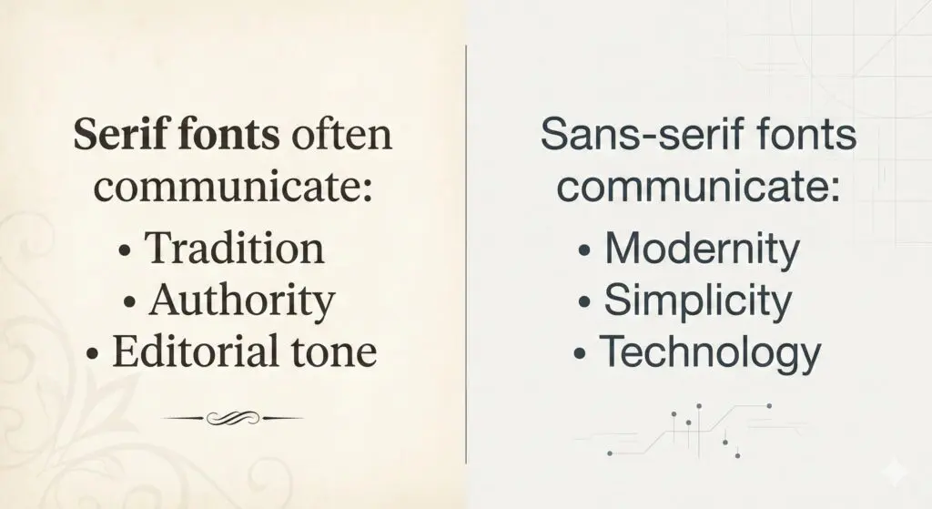
Serif and Sans Serif Pairing: Classic Formula
Serif and sans serif pairing works because it creates immediate visual contrast.
Serifs add structure and tradition. Sans serifs simplify and modernize.
You can use:
- Serif body + sans headings for modern editorial
- Sans body + serif headings for premium emphasis
Avoid pairing two similar serifs or two similar geometric sans fonts without strong contrast adjustments.
Classic contrast is reliable for a reason.
Modern Font Combinations for Digital and Brand Design
What makes modern font combinations feel contemporary?
- Clean geometry
- High x-height
- Minimal stroke contrast
- Open apertures
Modern does not mean sterile. Personality can come from spacing, scale, and layout.
These combinations perform especially well in UI and digital branding systems.
Font Pairing for Websites: What Works Best for UX and Readability
Effective font pairing for websites prioritizes clarity and performance.
Ideal Website Pairing Structure
- Headline 1: 48–64px
- Body: 16–18px
- Line height: 1.5 to 1.7
- Limit to 2–3 weights
A clear hierarchy improves scanning.
Mobile Optimization Tips
- Avoid thin weights
- Ensure sufficient contrast
- Test layouts at 375px width
- Increase line height slightly for small screens
Mobile readability is non-negotiable.
Performance Best Practices
- Limit font families
- Limit weight variations
- Prefer variable fonts
- Set system font fallbacks
Speed influences user retention.
Font Pairing for Logos: How to Combine Fonts Without Weakening Your Brand
Font pairing for logos differs from body typography. Logos are compact. They must work at multiple scales.
Common structures include:
- Wordmark + tagline
- Serif brand name + sans descriptor
- Custom display font + neutral support font
Keep it simple. Logo typography should be memorable and scalable.
Avoid trend-driven fonts that will age quickly.
Strong conceptual contrast works well. For example:
- Elegant serif brand name + minimal sans tagline
- Bold geometric wordmark + understated humanist descriptor
Font pairing example in a famous logo:
The Armani Exchange logo pairs a refined, high-contrast serif for “ARMANI” with a clean, geometric sans serif for “EXCHANGE,” creating immediate visual contrast. The elegant serif establishes luxury and heritage, while the minimal sans serif adds modern clarity without competing for attention.
Image: https://imgur.com/a/GePCv3z
Alt: Font pairing – Armani Exchange logo example
Tools and Websites to Discover and Test Font Pairing Ideas
Even with a strong framework, exploring real combinations accelerates learning. The platforms below help designers test, discover, and refine font pairing decisions for websites, branding, logos, and presentations.
These tools should support your system, not replace it.
Google Fonts
Best for: Free web projects, UI design, performance-focused builds
Google Fonts allows you to preview typefaces together and explore suggested pairings directly on each font page.
Why it’s useful:
- Live preview with adjustable size and weight
- Filter by category, width, and language support
- Variable font availability
- Web performance ready
How to use it effectively:
Start by selecting your body font. Then explore suggested pairings for headings. Test real paragraph content before finalizing.
Fontpair
Best for: Quick inspiration
Fontpair showcases curated combinations using Google Fonts. It organizes pairings by style and use case.
Why it’s useful:
- Simple visual comparisons
- Copy-ready font links
- Minimal interface
Best practice:
Use it for exploration, then validate the pairing using your scoring framework.
Typ.io
Best for: Real-world inspiration
Typ.io shows fonts used on real websites and how they are combined.
Why it’s useful:
- Real product examples
- Insight into hierarchy usage
- Exposure to practical UI typography
Study how headings, subheadings, and body text differ in weight and spacing.
Typespiration
Best for: Visual typography inspiration
Typespiration focuses on typography-based layout examples, including pairings.
Why it’s useful:
- Strong emphasis on visual hierarchy
- Good for branding and landing page inspiration
Use it to analyze spacing and proportion, not just font selection.
Final Thoughts: Mastering Font Pairing Takes Practice
Font pairing is not luck. It is a skill built through structured evaluation and repeated testing.
Focus on:
- Clear hierarchy
- Strong readability
- Mood alignment
- Practical implementation
Trends change. Structure does not.
Use the framework. Score your combinations. Test them in real layouts. With practice, creating strong typographic systems becomes predictable and consistent.
If you also need high-quality visual design to bring your typography and branding to life, consider Buzzcube’s unlimited graphic design services. For a flat monthly fee, you get unlimited design requests and revisions on brand graphics, marketing assets, social media visuals, UI elements, and more with fast turnaround and a dedicated designer working with your brand vision.
Frequently Asked Questions
How many fonts should I use?
Two font families are enough for most projects. One for headings and one for body text creates clarity and cohesion. Additional fonts are rarely necessary and often introduce inconsistency. Use weight and size variations before adding new families.
Can I pair two sans-serif fonts?
Yes, but ensure a strong contrast. Adjust width, weight, or personality differences. For example, pair a geometric sans for headings with a humanist sans for body. Avoid two fonts with nearly identical proportions.
What is the safest font pairing?
A classic serif for headings paired with a neutral sans serif for body is the safest structure. It creates natural contrast and works across editorial, corporate, and digital contexts.
How do I test if my font pairing works?
Apply the 10-point scoring system. Then test real content in headings, paragraphs, and buttons. Evaluate readability, hierarchy clarity, and mood alignment at multiple screen sizes.
Should headings and body fonts always contrast?
Not always, but hierarchy must be clear. Contrast can come from weight and size within the same family. The key requirement is visual distinction, not necessarily different categories.
Are Google Fonts good for professional font pairing?
Yes. Many Google Fonts, such as Inter, Source Serif, Playfair Display, and IBM Plex, are production-ready. They support multiple weights and languages, making them practical for professional use.