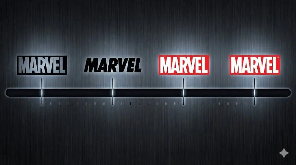
The evolution of the Marvel logo mirrors the growth of the brand itself. What began as simple publisher marks designed for print gradually transformed into one of the most recognizable visual identities in global entertainment. Each change reflects shifts in media, audience expectations, and design standards, from early comic covers to cinematic title screens.
Rather than relying on constant reinvention, Marvel’s logo history is defined by refinement and continuity. Typography, color, proportion, and structure were adjusted carefully over time, allowing the brand to evolve while remaining instantly recognizable. This balance between consistency and adaptation is what makes the Marvel logo a standout case study in long-term brand design.
Early Beginnings of the Marvel Logo (1939–1957)
Before becoming Marvel, the company went through two early branding phases that shaped its visual foundation. These logos were bold, symbolic, and designed to stand out on crowded newsstands.
Timely Comics Logo (1939–1951)
The Timely Comics logo used a shield shape, which gave it a strong and official look. The blue and white vertical stripes added structure, while the red “INC.” block in the center drew attention. At the top, the company name appeared in thin serif lettering, creating contrast against the bold shield design.
From a design point of view, this logo focused on authority and visibility. The shield made the brand feel established, while the color contrast helped it stand out on printed comic covers.
Atlas Comics Logo (1951–1957)
The Atlas Comics logo introduced a globe symbol with a wide banner across it. The bold “ATLAS” lettering was clear and easy to read, while the globe suggested scale and reach. The design was simple but strong, relying on symbolism rather than decoration.
This logo marked a shift toward global imagery and bold typography. It reflected a practical design approach during a transitional period, keeping the brand recognizable while the company prepared for its next evolution.
Marvel Comics Group Era (1951–1971)
The Marvel Comics Group era helped define the foundation of Marvel’s visual identity. During this time, the logo evolved through simple but important design changes.
1951–1957
This logo used thick, hand-drawn lettering designed for high visibility on comic covers. The rough shapes and uneven strokes reflected the printing style of the 1950s and helped 2the logo stand out on newsstands.
1961–1963
Marvel introduced a minimalist logo using the stacked initials “M” and “C” inside a rectangular border. The design was clean, bold, and easy to recognize, showing a shift toward a more structured brand look.
1963–1966
The logo expanded to display the full name “Marvel Comics Group.” While bold and readable, the layout felt slightly unbalanced, reflecting a transitional phase in the brand’s design development.
1966–1971
This version removed the frame and centered the text, creating a stronger and more balanced wordmark. Thicker lettering gave the logo a confident, professional appearance that better matched Marvel’s growing influence.
Simplification and Refinement of the Marvel Logo (1971–1987)
By the early 1970s, Marvel had settled on using its name alone as the logo. The focus during this period was no longer on structure, but on refining how the word “Marvel” looked and felt.
1971–1983: Balanced and Open Lettering
The 1971–1983 logo features the word “MARVEL” in a wide, horizontal layout. The letters are bold but not heavy, with enough spacing to keep the wordmark clear and easy to read. This design worked especially well on comic covers, where clarity at small sizes mattered.
From a design perspective, this logo shows careful control of proportion. The shapes are simple, the edges are clean, and the overall look feels stable and modern for its time.
1983–1987: Tighter Shapes and Stronger Presence
The 1983–1987 logo kept the same basic layout but refined the letterforms. The shapes became more compact and precise, giving the wordmark a firmer and more confident appearance.
This update improved consistency across print and merchandise. Rather than making the logo louder, Marvel made it clearer and more controlled. It reflects a brand that understood its identity and focused on improving details instead of chasing trends.
Color, Contrast, and Movement in the Marvel Logo (1987–1990)
This logo marks the first decisive use of red and yellow, a color pairing that immediately increased visual impact. Red established strength and urgency, while yellow added contrast and improved legibility. Together, they made the logo impossible to miss on a comic rack.
The typography was italicized, introducing forward motion into the wordmark. This was not decorative. The slant created momentum and matched the action-driven tone of Marvel’s stories. The oversized red “M” acted as a backdrop, anchoring the composition and giving the logo a strong visual center.
From a design standpoint, this logo shows Marvel moving beyond refinement and into expression. The brand began using color, scale, and motion as tools, not just type. It was a confident step toward a more emotional and energetic identity, and it set the stage for the bold red box logos that followed in the 1990s.
Translating the Marvel Logo from Comics to Film (1993–2002)
The 1987–1990 logo established a bold visual language built on color contrast, layered forms, and expressive typography. When Marvel began moving into film production, the challenge was not to change that identity, but to adapt it for motion, scale, and screen-based storytelling. The logos that followed show how Marvel adjusted tone and material without losing recognition.
Marvel Films Logo (1993-1996)
The Marvel Films logo carried over the layered structure from the comic-era emblem but shifted the visual mood. Bright comic colors gave way to darker, metallic blues, adding depth and seriousness. Red remained present, but it was used more selectively to avoid visual noise on screen.
From a design perspective, this logo introduced cinematic weight. The typography still felt bold and familiar, but the finish and color choices helped the logo sit comfortably alongside live-action visuals. It signaled that Marvel was entering film cautiously, while still relying on its established brand strength.
Marvel Studios Logo (1996-2002)
With the move from “Films” to “Studios,” the logo became more refined and controlled. Gradient textures and heavier surfaces gave the mark a more industrial and polished feel. The composition tightened, and the overall look felt more deliberate.
This logo reflects Marvel thinking long-term. It was no longer experimenting with film as an extension of comics. The branding communicates stability, ambition, and readiness for scale. Design-wise, it marks the bridge between early film branding and the modern Marvel Studios identity that would soon follow.
Consolidating the Brand: The Red Box Marvel Logo (2002–2008)
In 2002, Marvel made a decisive branding move by adopting the red box wordmark as its primary logo across the entire company. This design, already familiar from Marvel Comics, featured bold white lettering tightly set inside a solid red rectangle.
From a design perspective, this logo was about clarity and control. The strong contrast made it instantly recognizable, while the compact rectangular shape allowed it to work consistently across film titles, merchandise, and marketing materials. There were no decorative elements and no secondary type. Everything was reduced to the essentials.
This logo arrived at a critical moment. As Marvel began building its cinematic universe, it needed a single symbol that could unify many characters, stories, and formats. The red box logo did exactly that. It was neutral enough to sit alongside different superhero identities, yet bold enough to command attention on screen.
More than a redesign, this was a statement of intent. The 2002–2008 logo marked the point where Marvel fully aligned its visual identity with its future as a global entertainment brand.
Modern Marvel Studios Logo: First Studio System (2008–2013)
In 2008, Marvel Studios refined its logo to better suit large-scale cinematic presentation. The familiar red box and bold “MARVEL” wordmark remained unchanged, but the studio identity was clarified through structure rather than decoration.
Two horizontal lines were added beneath the main wordmark, creating a defined base. Between these lines, the word “STUDIOS” was introduced in widely spaced lettering, stretched across the full width of the logo. This spacing was intentional. It added balance, slowed the visual rhythm, and grounded the composition.
From a design perspective, this logo shows Marvel thinking in systems, not symbols. The hierarchy is clear. “MARVEL” dominates, while “STUDIOS” supports without competing. The horizontal rules act as anchors, making the logo feel stable and authoritative on screen.
This version marked the moment when Marvel Studios’ identity became fully cinematic. It was designed to hold up in opening title sequences, trailers, and global releases. The logo does not chase style. It relies on proportion, alignment, and consistency, signaling confidence at the beginning of a long-term franchise.
Precision Refinement of the Marvel Wordmark (2012–2016)
The update introduced in 2012 focused on refining the existing Marvel wordmark rather than redefining it. The red box, white lettering, and overall proportions remained unchanged, preserving instant recognition. The work happened at a typographic level, where letter spacing and internal connections were carefully adjusted to improve balance.
Subtle changes, such as tighter spacing toward the end of the wordmark and cleaner letter joins, made the logo more controlled and consistent across digital and cinematic use. From a design perspective, this phase reflects restraint and confidence. Marvel treated its logo as a finished system and focused on precision, maintaining continuity until the brand introduced a new visual direction in 2016.
Modern Marvel Studios Logo: Split Identity System (2016–Today)
Introduced in 2016, this version of the Marvel Studios logo formalized the brand into a clear, modular system. The mark is divided horizontally into two equal visual blocks. On the left, the classic red box with the white “MARVEL” wordmark preserves brand heritage. On the right, “STUDIOS” appears in black, set on white and framed by horizontal rules.
From a design perspective, this logo is about clarity and hierarchy. Marvel remains dominant, while Studios is treated as a precise descriptor rather than a competing element. The contrast between red and white creates separation without fragmentation, allowing the logo to function cleanly across film openings, marketing, and digital platforms. This version reflects a mature brand that values structure, consistency, and long-term recognition over visual experimentation.
What the Marvel Logo’s Evolution Tells Us About Branding
The Marvel logo changes over time show a brand that understands restraint as much as expression. Early experimentation gave way to clarity, then to system-based design capable of scaling across comics, film, merchandise, and digital platforms. Each phase built on the last, ensuring recognition was never sacrificed for novelty.
This approach offers a valuable lesson for modern brands. Strong identities are not defined by frequent redesigns, but by thoughtful evolution. Marvel’s success lies in knowing when to simplify, when to refine, and when to standardize. That discipline is what allows a logo to remain relevant for decades.
If you’re building or refining a brand today, the same principles apply. At Buzzcube, we help businesses create identities that are clear, scalable, and built to last. Whether you’re launching something new or refining an existing brand, our design team focuses on strategy, consistency, and long-term impact, not short-term trends.
FAQs
1. When was the first Marvel logo created?
The earliest Marvel-related logos date back to 1939, during the Timely Comics era. These early designs were created for print visibility and laid the groundwork for Marvel’s future visual identity.
2. Why is red such an important color in the Marvel logo?
Red delivers high contrast, energy, and immediate visibility. Over time, it became closely associated with Marvel’s brand and was standardized to ensure consistency across all platforms.
3. What was the most important Marvel logo redesign?
The 2002 adoption of the red box wordmark was a key turning point. It unified Marvel’s identity across comics, film, and licensing, creating a single, powerful brand symbol.
4. Why did Marvel split the logo into “Marvel” and “Studios” in 2016?
The split design clarified brand hierarchy. “Marvel” represents the parent brand, while “Studios” functions as a descriptor, allowing the logo to work cleanly in cinematic contexts.
5. What can designers learn from Marvel logo history?
Marvel’s logo evolution shows the value of consistency, refinement, and system-based design. Successful brands evolve through small, intentional improvements rather than constant reinvention.