Vintage fonts continue to perform well across branding, packaging, and editorial design because they communicate character immediately. When chosen correctly, they add depth and authenticity without sacrificing clarity. When chosen poorly, they feel forced, unreadable, or dated.
The best vintage fonts balance nostalgia with structure. They reference older typographic styles while remaining usable in modern layouts, on modern screens, and across multiple formats. These fonts are not decorative extras. They shape perception, influence trust, and often become the most memorable part of a design.
This guide breaks down the best vintage fonts by category, era, and use case, based on how they actually behave in real design work.
Why Vintage Fonts Continue to Work
Vintage typography succeeds because it introduces familiarity. Serif structures recall print history. Script fonts echo hand-painted signage. Display fonts pull from decades where lettering carried more personality than polish.
In branding, this familiarity creates instant context. A well-selected vintage font can make a brand feel established, handcrafted, or culturally rooted within seconds. In contrast to neutral modern sans-serifs, vintage fonts often do more emotional work with fewer elements.
When paired with clean layouts and modern spacing, vintage fonts feel intentional rather than nostalgic for its own sake.
What Defines a Vintage or Retro Font
Vintage fonts typically reference typographic styles from the early 1900s through the late 1980s. Retro fonts are modern recreations that borrow those visual cues while correcting technical limitations.
Common characteristics include:
- High contrast between strokes
- Decorative or expressive letterforms
- Visible influence from print, signage, or advertising
- Strong personality over neutrality
The difference matters in practice. True vintage-inspired fonts often feel more authentic, while retro fonts tend to perform better across digital environments.
Best Vintage Fonts by Category
Different design goals require different typographic behavior. Grouping vintage fonts by category helps avoid mismatches that look good in isolation but fail in real layouts.
Best Vintage Serif Fonts
Vintage serif fonts bring structure and credibility. They perform best in projects that need authority without feeling corporate.
These fonts are commonly used in:
- Editorial layouts
- Packaging and labeling
- Heritage and luxury branding
The strongest vintage serif fonts maintain consistent spacing and readable proportions. They hold up at small sizes and don’t collapse when used in longer blocks of text. When paired with modern sans-serif body fonts, they feel timeless rather than heavy.
Caslon Antique
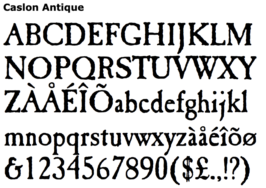
Caslon Antique is a classic choice for heritage-style branding. The letterforms feel aged without becoming decorative. It holds up well in logos and short headlines, but spacing needs adjustment for longer text. It works best when paired with a neutral sans-serif for body copy.
Playfair Display
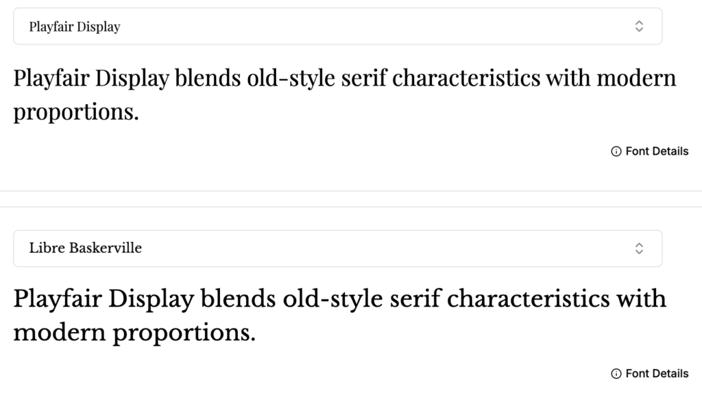
Playfair Display blends old-style serif characteristics with modern proportions. It performs reliably in editorial layouts and large headings. At smaller sizes, it remains readable, though it should not be over-weighted. It is a strong option when a design needs elegance without stiffness.
Libre Baskerville
Libre Baskerville is designed specifically for screen readability. The wider counters and taller x-height help it stay legible on mobile devices. It works well for long-form content that needs a traditional tone without sacrificing comfort.
Best Vintage Script Fonts
Vintage script fonts are expressive by nature. They are most effective when used sparingly and intentionally.
They work best for:
- Logos and wordmarks
- Product names
- Accent headlines
High-quality vintage script fonts maintain rhythm and balance between letters. Poorly made scripts often look appealing in previews but break down in real use due to inconsistent spacing. The best ones feel fluid without sacrificing legibility.
Pacifico
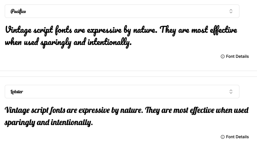
Pacifico has become one of the most common font choices for casual vintage branding. Its smooth curves and consistent stroke weight make it readable even at smaller sizes. It works well for logos and short phrases but becomes repetitive if overused.
Lobster
Lobster is bold and expressive. It works best in headlines and signage where space is generous. In tight layouts, the letter connections can feel crowded, so spacing adjustments are often necessary.
Best Vintage Display Fonts
Vintage display fonts are designed to lead. They are bold, stylized, and often carry the strongest era references.
They are ideal for:
- Posters and flyers
- Album covers
- Hero headlines
Because of their visual weight, these fonts should never compete with other decorative elements. In practice, they work best when supported by neutral secondary fonts and generous white space.
Bebas Neue
While more restrained, Bebas Neue borrows heavily from mid-century display styles. It works well for posters and bold headlines. Its narrow width helps in vertical layouts, though it lacks lowercase characters.
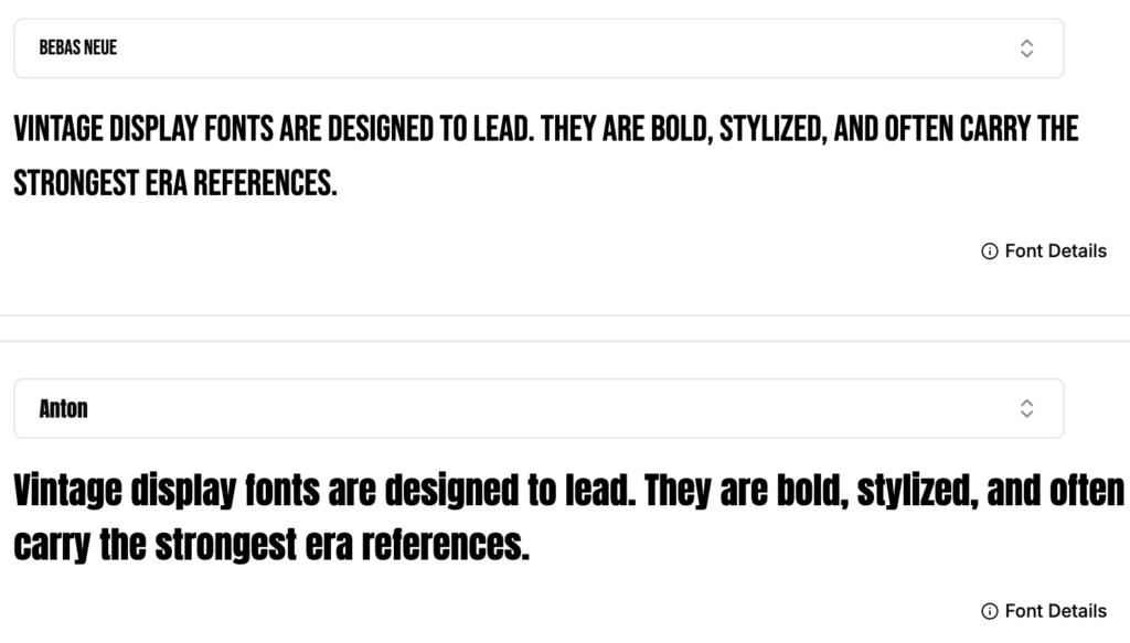
Anton
Anton is bold, condensed, and impactful. It performs well in modern retro designs where clarity and strength matter more than subtle detail.
Retro Fonts by Era
Some projects demand a specific time reference. In those cases, typography must match the cultural tone of the era, not just the visual style.
70s Fonts: Soft, Rounded, and Expressive
70s fonts are defined by movement and warmth. Letterforms tend to be rounded, loose, and heavily stylized.
They perform well in:
- Music and lifestyle branding
- Event posters
- Packaging with bold color palettes
These fonts create instant personality but can overwhelm layouts if overused. The strongest results come from using them in short bursts, supported by restrained typography elsewhere.
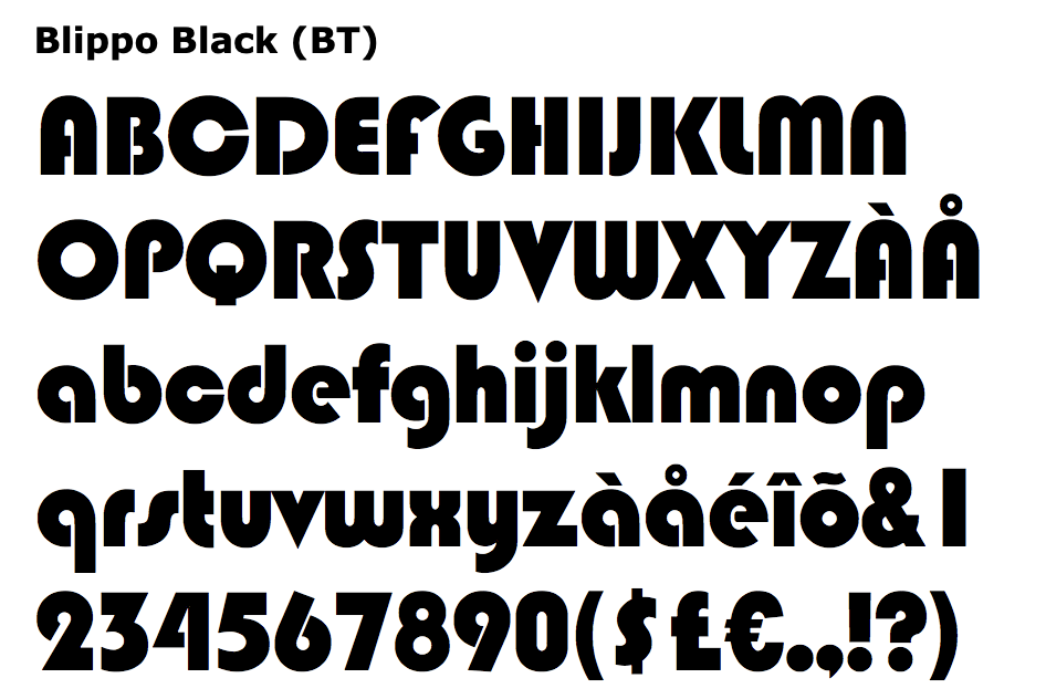
Blippo
Blippo captures the rounded, geometric feel of 1970s typography. It works well in playful designs but requires careful color pairing to avoid looking dated.
ITC Avant Garde
Avant Garde defines 70s modernism. It performs best in headlines and logos, though its tight letter spacing often needs correction.

80s Fonts: Sharp, Bold, and Graphic
80s fonts are more rigid and dramatic. They often feature sharp angles, thick strokes, and strong contrast inspired by early digital design.
They work best for:
- Entertainment and gaming brands
- Event graphics
- Retro-futuristic visuals
These fonts demand careful handling. When spacing or contrast is off, they quickly feel chaotic. When used with discipline, they create energy and confidence.
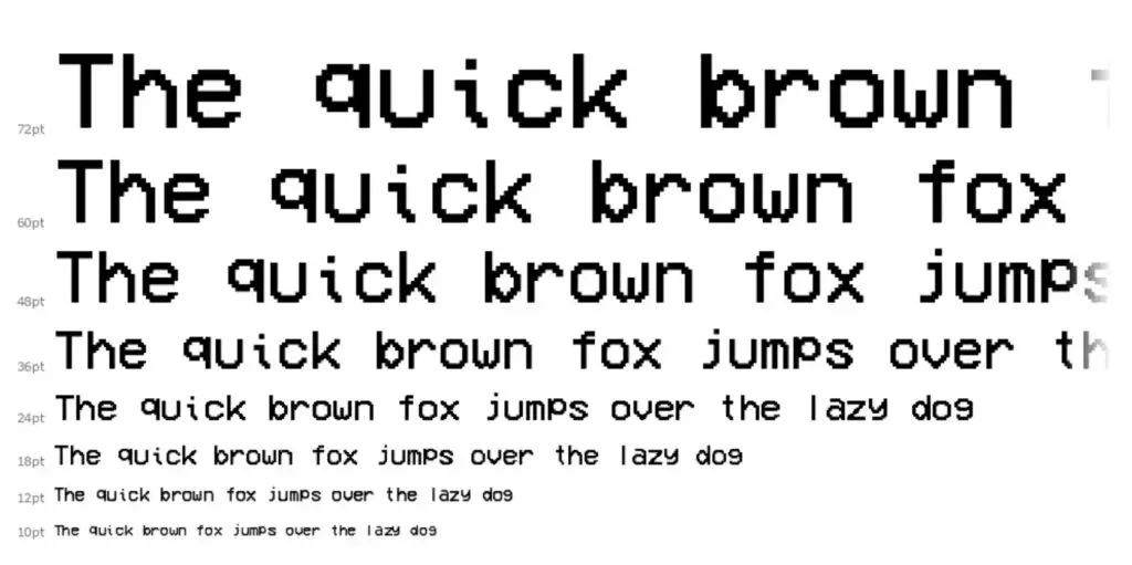
VCR OSD Mono
This font leans heavily into 80s digital nostalgia. It works in small doses for thematic designs but lacks flexibility for broader use.
How to Choose Vintage Fonts for Branding
Branding typography must work across formats. A vintage font should feel distinctive without limiting flexibility.
Key considerations include:
- Brand tone and personality
- Legibility at small sizes=
- Scalability across print and digital
- Compatibility with secondary fonts
Vintage fonts for branding are most effective when paired with neutral supporting typography. This allows personality to shine without compromising usability.
Best Practices for Using Vintage Typography
Strong vintage typography relies on restraint.
Effective usage includes:
- Pairing expressive fonts with clean layouts
- Using modern spacing and alignment
- Avoiding excessive textures or distressing
- Maintaining hierarchy and readability
Vintage fonts should feel deliberate, not decorative.
Common Mistakes with Vintage Fonts
Design issues often come from misuse rather than font quality.
Common problems include:
- Mixing multiple eras in one layout
- Using display fonts for long text
- Ignoring spacing and hierarchy
- Over-styling already expressive fonts
In most cases, simplifying the typography improves the result immediately.
Final Thoughts
The best vintage fonts succeed because they combine character with control. They feel expressive without becoming chaotic. They reference the past while functioning in modern design systems.
When typography is chosen with intention, it becomes more than decoration. It becomes structure, tone, and identity. Vintage fonts, used correctly, remain one of the most effective tools for creating memorable design.
Looking to turn retro typography into a brand that actually feels premium and consistent? BuzzCube’s graphic design services builds clean, modern websites with strong visual identity, fonts, layout, and performance included. Reach out to us to design a site that looks distinctive and converts.
Frequently Asked Questions
What are the best vintage fonts for logos?
Vintage serif and script fonts perform best because they provide character while remaining recognizable at small sizes.
Are vintage fonts free for commercial use?
Some are, but many free fonts are limited to personal use. Licensing should always be reviewed before commercial application.
What is the difference between retro and vintage fonts?
Vintage fonts closely reference historical typography. Retro fonts are modern interpretations inspired by those styles.
Which fonts work best for retro designs?
Bold display fonts, classic serifs, and era-specific scripts work best for retro designs.

