The DC logo is more than a publisher mark. It is a visual record of how one of the world’s most influential comic brands learned to define itself, refine its identity, and adapt to new media without losing recognition. Over more than eight decades, DC’s logo has shifted from quiet attribution to bold emblem, and finally into a flexible system designed for a global entertainment brand.
Unlike logos built for a single era or platform, the DC Comics emblem has had to work across print, film, television, merchandise, and digital environments. Each redesign reflects a broader change in how DC viewed its role: first as a publisher, then as a unified brand, and eventually as a cross-media powerhouse.
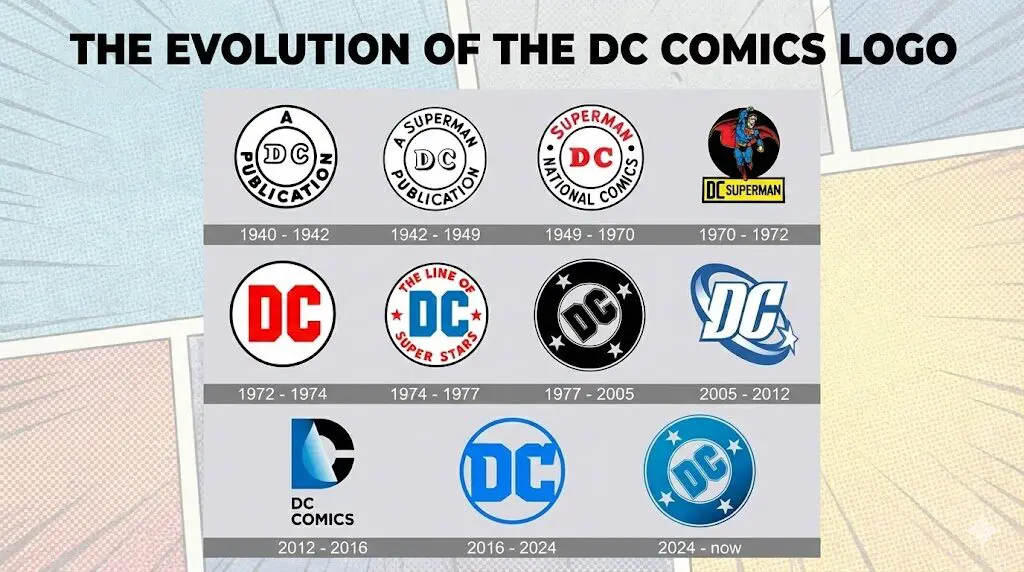
This breakdown explores the evolution of the DC logo through three clear design eras. Each era reveals how typography, geometry, symbolism, and restraint shaped one of the most recognizable identities in pop culture.
Era One: Early DC Logo History and Publisher Marks (1940–1972)
Primary role: Publisher identification
Brand anchor: Superman
Design priority: Function over expression
DC’s earliest logos were not built to function as brand symbols in the modern sense. They were publisher marks, meant to identify ownership rather than create recognition.
Early Publisher Marks in DC Logo History
- Circular badges reading “A DC Publication”
- Minimal visual weight and simple line work
- Serif letterforms typical of print publishers
- Logos played a secondary role to cover art
At this stage, DC relied on content and characters to sell books. The logo existed mainly for attribution.
Superman’s Role in Early DC Comics Branding
- “Superman” added directly into the circular logo
- DC positioned itself as the publisher behind its most valuable character
- The logo gained visibility but remained text-driven
- Recognition came from character association, not design uniqueness
From a design standpoint, this was a pragmatic strategy. Superman carried cultural authority, so the logo leaned on that equity rather than trying to establish its own visual voice.
Character-Led DC Logos Before Brand Unification
- Circular emblems briefly abandoned
- “DC” paired directly with Superman imagery or naming
- Characters functioned as trademarks
- Flexible but inconsistent system
This short phase prioritized immediacy and familiarity over cohesion. While effective on individual covers, it diluted DC’s brand unity and exposed the limits of character-led identity alone.
Design takeaway
This era shows DC operating as a content-first publisher, not a brand-led company. Logos served practical purposes, while Superman carried the emotional and commercial weight. The lack of a unified visual system would later push DC toward stronger emblem-based branding
Era Two: The Rise of the DC Comics Emblem and Brand Stability (1972–2005)
Primary role: Unified brand symbol
Design focus: Recognition, stability, scalability
This era marks DC’s transition from flexible publisher marks to a deliberate, system-driven identity. The logo became the visual constant across an increasingly diverse catalog.
The Circular DC Logo and Emblem Standardization
- Circular badge reinstated as the core form
- “DC” rendered in heavy, geometric letterforms
- High contrast improved visibility on busy covers
- Logo positioned as a fixed anchor point
From a design perspective, this move restored discipline. The circle created a controlled frame that isolated the logo from illustration styles, while the block lettering introduced authority. DC began treating the logo as infrastructure rather than decoration.
Stars, Messaging, and the Meaning Behind the DC Logo
- Tagline introduced to unify characters under one banner
- Star symbols reinforced heroic mythology
- Blue added as a brand color to soften severity
- Logo placement became more intentional and prominent
This phase layered narrative onto structure. The emblem didn’t just identify DC, it communicated scope and ambition. While more complex, the system remained cohesive because the core geometry stayed intact.
The DC Bullet Logo and Long-Term Brand Consistency
- Simplified circular emblem with centered “DC”
- Removal of taglines and secondary text
- Designed to scale, crop, rotate, and recolor
- Maintained consistency across decades
The DC Bullet is a masterclass in restraint. By stripping the logo down to its essentials, DC achieved maximum flexibility without sacrificing recognition. This mark succeeded because it prioritized usability over trend, making it one of the most durable identities in comics publishing.
Design takeaway
This era shows DC operating as a brand-first publisher. The logo stopped reacting to characters and instead provided a stable framework they could live within. From a design perspective, this was DC’s most successful period of visual consistency.
Era Three: Modern DC Logo Redesigns and Media Expansion
Primary role: Cross-media identity
Design focus: Motion, flexibility, digital-first systems
This era reflects DC’s shift from a print-led publisher to a multi-platform entertainment brand. Logos were no longer static stamps; they became adaptive assets built for film, television, streaming, and digital environments.
The DC Spin Logo and Cinematic Branding Shift (2005 – 2012)
- Letterforms tilted and beveled for depth
- Orbital ring and star introduced implied movement
- Blue gradients added dimensionality
- Designed to animate easily in film intros
This logo embraced motion as meaning. The orbit suggested a shared universe, while highlights and gradients reflected early-2000s digital aesthetics. From a design standpoint, it prioritized cinematic presence over print restraint, signaling DC’s push into blockbuster storytelling.
The DC Peel Logo and Dual-Identity Symbolism (2012 – 2016)
- “D” peeling back to reveal the “C”
- Soft gradients and curved edges
- Mark paired with “DC Entertainment”
- Designed for animation and reveal effects
Conceptually, this was DC’s most symbolic mark. The peeling action mirrored superhero duality, identity versus disguise. While visually clever, the complexity reduced instant recognition at small sizes, exposing the tradeoff between concept and clarity.
Modern DC Logo Simplification and System Design (2012 – 2024)
- Simplified circular frame reintroduced
- Flat color palette restored clarity
- Heavy geometric “DC” emphasized
- Designed for consistency across platforms
This redesign corrected course. By stripping effects and returning to strong geometry, DC rebuilt trust in its core symbol. The logo worked equally well in motion, print, and digital contexts, proving that simplicity scales better than spectacle.
DC Logo Revival and Return to the Classic Emblem (2024 – Today)
- Classic circular emblem revived
- Star motif reinstated
- Vintage proportions refined for modern use
- Deployed across comics, merchandise, and studios
This move was not nostalgia for its own sake. It was strategic. By reviving a proven system and refining it for current media, DC signaled confidence in its legacy while maintaining modern execution standards. Design-wise, it closes the loop between history and future.
What the DC Logo’s Evolution Teaches About Brand Design
DC’s logo history shows that strong branding is not about constant reinvention. It is about knowing when to experiment, when to simplify, and when to return to proven structures. The earliest marks focused on attribution, the middle era built long-term recognition through disciplined emblems, and the modern era balanced motion, media demands, and heritage.
From a design perspective, the most successful DC logos share one trait: clarity. When the logo prioritized usability, scalability, and restraint, it endured. When concept or effect took precedence, revisions followed. The 2024 return to a refined classic emblem is not a step backward. It is a signal of brand confidence and design maturity.
At Buzzcube, we apply the same thinking to modern brands. Whether you’re evolving an existing identity or building one from the ground up, effective logo design starts with understanding purpose, context, and longevity. If you’re ready to create a brand system that grows with your business, our design team can help you build it with intention.
FAQs
How many times has the DC logo changed over time?
DC has redesigned its logo multiple times since 1940, but these changes fall into three major design phases: early publisher marks, emblem-based brand systems, and modern media-focused identities. Each shift reflects a change in how DC positioned itself as a company.
What is the meaning behind the DC logo?
At its core, the DC logo represents authority, legacy, and unity across characters. Earlier versions emphasized publisher identity, while later emblems focused on creating a single visual anchor for an expanding universe of stories and media.
Which DC logo is considered the most iconic?
The circular “DC Bullet” logo is widely regarded as the most iconic. Its strength came from simplicity, balance, and flexibility, allowing it to remain effective for decades across print, merchandise, and branding.
Why did DC return to a classic logo style in 2024?
The 2024 redesign reflects a strategic return to proven brand equity. By reviving and refining a familiar emblem, DC reinforced recognition while adapting the design for modern production and digital use.
How has the DC logo changed for film and digital platforms?
As DC expanded into film and streaming, logos became more motion-friendly and adaptable. Elements like rotation, reveals, and simplified geometry helped the identity perform consistently across screens without losing clarity.