Choosing the right font can transform a website faster than almost any other web design decision. A good font makes content feel lighter, cleaner, and easier to take in. A poor choice does the opposite. It slows the reader down and creates tension without meaning to. Google Fonts makes the process simple because every option is free for commercial use and works across devices.
This guide highlights seven Google Fonts that perform exceptionally well on real websites, offering strong readability, clean structure, and reliable behavior on modern screens. As we move into 2026, these fonts make choosing the right typography simpler and more effective.
Now let’s look at why the right font matters so much.
Why Choosing the Right Google Font Matters
Typography sets the tone of a website long before the message is understood. A clean font builds trust. A heavy or awkward one can push visitors away. Good typography creates rhythm and structure. It guides the eye from section to section without effort.
A font also carries personality. Some fonts feel modern. Others feel warm or formal. When the personality of the font matches the personality of the brand, the entire website feels more coherent.
Readability plays a major role. Clear shapes reduce strain. Balanced spacing makes long paragraphs easier. These qualities matter on mobile, where most users read in quick bursts.
All Google Fonts are free for commercial use, which removes licensing concerns. This freedom lets web designers experiment until the right match appears.
With that in mind, choosing a font becomes much easier when a few principles guide the process.
How to Choose the Best Google Font for Your Website
Good typography begins with readability. Body text should feel natural at both small and medium sizes. If a font feels tight or sharp on mobile, it will not perform well in real use.
Brand personality plays a strong part. Rounded shapes feel friendly. Geometric forms feel modern. Sharper edges feel technical. A font that mirrors the brand message always works better.
Weight selection matters too. Most websites only need regular, medium, and bold. These three levels create a clear hierarchy without slowing the page down. Loading too many weights increases request time.
Pairing fonts becomes easier once roles are clear. One font leads with headings. The other supports paragraphs. A calm body font works well under a stronger heading font. The contrast should feel balanced, not forced.
On WordPress, adding Google Fonts is straightforward. Many themes include built-in options. Plugins can handle the rest. Loading only the necessary weights keeps performance strong.
With the approach in place, the next step is choosing the fonts that actually deliver.
The 7 Best Google Fonts for Websites in 2026
These seven fonts have been tested in real layouts; some of them are the most common fonts used by web designers. They all read well, scale well, and bring the right tone to a wide range of websites.
1. Inter
Inter is built for clarity. The shapes feel open and relaxed, which helps the eye move through text without effort. It holds up well at small sizes, especially on mobile. Headings stay sharp, and paragraphs stay calm. When a layout needs clean structure with no complications, Inter is one of the safest choices.

2. Roboto
Roboto is clean and predictable. That is its strength. It never tries to impress with personality. It simply works everywhere. In UI heavy layouts like dashboards or apps or anything with forms, Roboto keeps everything steady and readable. It is one of the most dependable fonts in the Google library.

3. Open Sans
Open Sans reads well at any size. It is safe and neutral, which makes it ideal for brands that want typography to feel invisible. Some projects need a body font that never competes with the message. Open Sans handles that role without problems. It is a simple choice that works across almost anything.

4. Montserrat
Montserrat brings a strong geometric presence. It has clean structure and enough weight to stand out in headings. Modern brands use it because it feels confident without feeling heavy. For long paragraphs it can feel stiff, but as a heading font it shapes the page with clarity.

5. Lato
Lato blends professionalism with a warm tone. The curves soften the look, which makes it comfortable to read in longer sections. It pairs well with stronger heading fonts and works across many industries. When a layout needs calm, steady paragraphs, Lato delivers.

6. Poppins
Poppins gives a friendly, modern feel the moment it loads. The round, geometric shapes create a clean and energetic look. It works well in headlines and buttons where clarity and personality matter. For long reading it can feel a bit too round, so it performs best in short bursts.

7. Merriweather
Merriweather is a serif that reads well on screens. The shapes feel warm and balanced, which makes it ideal for content heavy pages. It holds structure nicely on mobile and gives long articles a comfortable flow. When a design needs a serif with a modern touch, Merriweather stands out.

Now that the key fonts are clear, grouping them by use case can help refine the decision further.
Best Google Fonts by Category
These categories make the selection process faster. Each one reflects a specific design goal.
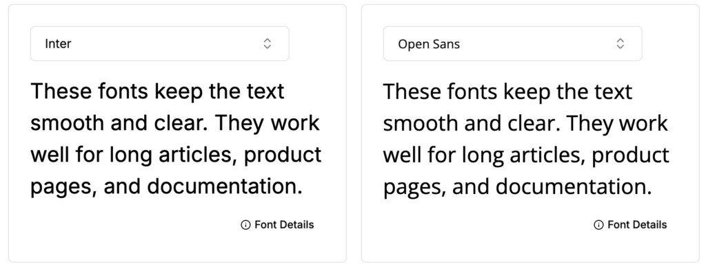
Best Google Fonts for Readability
- Inter
- Open Sans
These fonts keep the text smooth and clear. They work well for long articles, product pages, and documentation.
Best Google Fonts for Headings
- Montserrat
- Poppins
These fonts add structure and presence. They help sections stand out without overwhelming the page.

Best Google Fonts for Logos and Branding
- Raleway
- Rubik
These options offer more personality. They create stronger brand recognition and sharper visual identity.

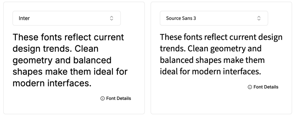
Modern Google Fonts for 2026
- Inter
- Source Sans 3
These fonts reflect current design trends. Clean geometry and balanced shapes make them ideal for modern interfaces.
Are Google Fonts Free for Commercial Use?
Yes. Every Google Font is free for commercial use. They can appear in websites, apps, printed materials, and logos with no licensing fees.
With the right font selected, the final step is keeping everything fast.
How to Optimize Google Fonts for Better Performance
Font performance has a direct effect on page speed. Fewer weights mean faster loading. Many websites only need regular, medium, and bold. Anything more slows things down.
Setting the font display property to swap helps text appear immediately. It prevents invisible text during loading and improves the overall experience.
Preloading key font files reduces layout shifts. This helps the page render cleanly from the start.
Hosting fonts locally is another option. It gives the site more control over delivery and can improve reliability.
With performance handled, the focus shifts to pairing fonts that work well together.
Simple Google Font Pairings That Work Well
Good pairings feel natural. They give the page a clear hierarchy and a balanced tone.
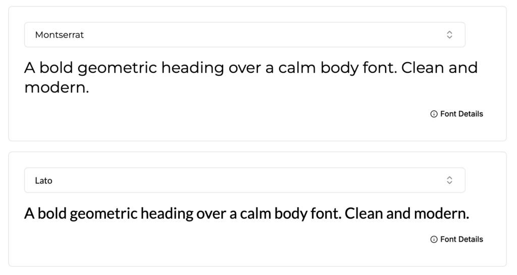
Montserrat with Lato
A bold geometric heading over a calm body font. Clean and modern.
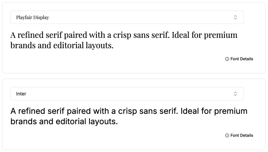
Playfair Display with Inter
A refined serif paired with a crisp sans serif. Ideal for premium brands and editorial layouts.
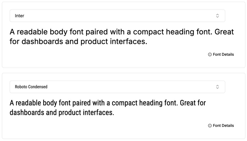
Inter with Roboto Condensed
A readable body font paired with a compact heading font. Great for dashboards and product interfaces.
These combinations give structure without adding noise.
Final Thoughts
The best Google Fonts for websites share a few traits. They read well. They reflect the brand tone. They stay consistent across devices. When the typography is chosen with care, a website becomes easier to understand and more enjoyable to use.
The seven fonts in this guide deliver dependable results. Some are strong in headings. Others excel in long reading. Each one brings clarity to the page without overpowering the design.
A clear font choice sets the foundation for a clean and trustworthy website. With the right typography, every part of the layout benefits.
Looking to elevate your brand with professional web or graphic design? Our design services can help you create a modern, high-impact visual identity. Contact us today to get started.
Frequently Asked Questions
What are the best Google Fonts for websites in 2025?
Inter, Roboto, Open Sans, Montserrat, Lato, Poppins, and Merriweather are the top Google Fonts for websites because they are modern, readable, and perform well across devices.
Which Google Fonts are best for readability?
Inter and Open Sans are the best Google Fonts for readability due to their open shapes, smooth spacing, and strong performance on mobile screens.
What are the best Google Fonts for headings?
Montserrat and Poppins work well for headings because they offer strong visual presence and clear geometric forms that stand out without overwhelming the layout.
Are Google Fonts free for commercial use?
Yes. All Google Fonts are 100% free for commercial and personal use, including websites, apps, logos, and printed materials.
What are the most modern Google Fonts for 2025 and 2026?
Inter and Source Sans 3 are among the most modern Google Fonts, featuring clean geometry and consistent performance for modern UI and web design.
What are the best Google Fonts for logos and branding?
Raleway and Rubik are great choices for logos because they have stronger personality and visual character, making brands more memorable.
How do I choose the right Google Font for my website?
Focus on readability, brand personality, and hierarchy. Select a body font that is comfortable to read and pair it with a clear, structured heading font.
How can I optimize Google Fonts for better website performance?
Load only necessary weights, use font-display: swap, preload key font files, or host fonts locally to improve speed and reduce layout shifts.
What are some Google Font pairings that work well?
- Montserrat + Lato – Modern and clean
- Playfair Display + Inter – Premium editorial look
- Inter + Roboto Condensed – Great for dashboards and UI
Can I use Google Fonts on WordPress?
Yes. Most WordPress themes support Google Fonts natively, and plugins can load additional fonts, just keep weights minimal for performance.

